Accessibility in UI Design: A Practical Guide
Accessibility is an essential part of modern digital design. Digital products should be usable by everyone, including people with different abilities, devices, and environments.
Millions of users interact with websites and applications every day, and not all of them experience products in the same way. Some users may have visual impairments, motor limitations, hearing difficulties, or cognitive challenges.
Designing accessible interfaces ensures that these users can still interact with digital products effectively.
Accessibility is not only about compliance or guidelines. It is about creating inclusive digital experiences that work for everyone.
Understanding Accessibility in UI Design
Accessibility refers to designing digital interfaces that can be used by people with a wide range of abilities.
Some users may experience challenges such as:
- limited vision
- color blindness
- hearing impairments
- motor limitations
- cognitive difficulties
Designers must consider these challenges when creating digital experiences.
Accessible design ensures that users can perceive, understand, navigate, and interact with digital products.
Accessibility improves usability for everyone, not just users with disabilities.
For example, strong color contrast helps users with visual impairments, but it also improves readability for users viewing screens in bright environments.
The Importance of Accessibility in Modern Products
Accessibility is becoming increasingly important as digital products reach global audiences.
Inclusive design provides several benefits:
- broader audience reach
- improved usability for all users
- better user satisfaction
- stronger brand reputation
- compliance with accessibility standards
Many organizations also follow accessibility regulations such as the Web Content Accessibility Guidelines (WCAG) to ensure their products meet usability standards.
Designers who understand accessibility principles can build products that are both inclusive and scalable.
Following WCAG Accessibility Guidelines
The Web Content Accessibility Guidelines provide a framework for building accessible digital experiences.
These guidelines are based on four key principles.
Perceivable
Information must be presented in ways that users can perceive.
Examples include:
- providing text alternatives for images
- ensuring sufficient color contrast
- allowing content to be resized without losing readability
Operable
Users must be able to interact with the interface.
Designers should ensure:
- keyboard accessibility
- clear navigation patterns
- visible focus indicators
Understandable
The interface should be easy to understand.
This includes:
- simple language
- consistent layouts
- predictable navigation
Robust
Content should work across different devices, browsers, and assistive technologies.
Following these principles helps designers create experiences that remain accessible across different environments.
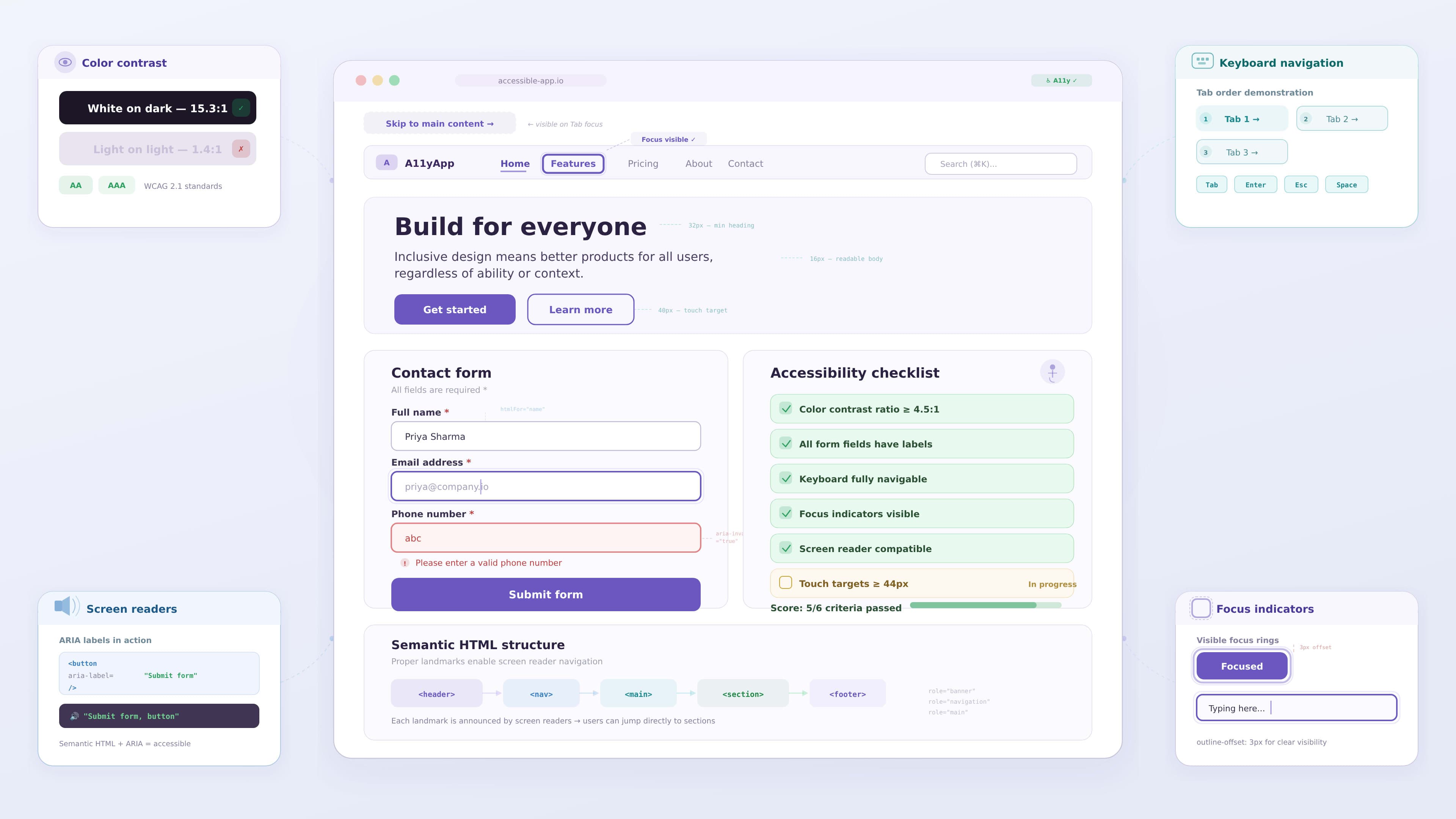
Using Proper Color Contrast
Color contrast plays a major role in accessibility.
Low contrast between text and background can make content difficult to read for many users.
Designers should ensure sufficient contrast between UI elements.
Best practices include:
- using dark text on light backgrounds
- avoiding low contrast color combinations
- testing contrast ratios with accessibility tools
Clear contrast improves readability and reduces eye strain for users.
For example, dashboard interfaces often display important data using color. Designers should ensure that data remains understandable even if users cannot distinguish certain colors.
Designing Accessible Navigation
Navigation should be simple and predictable so users can move through the interface easily.
Clear navigation improves usability for all users, especially those relying on assistive technologies.
Designers can improve navigation by:
- using clear and descriptive labels
- maintaining consistent menu structures
- highlighting active navigation states
- providing clear page hierarchy
Accessible navigation also supports keyboard users who rely on tab navigation instead of a mouse.
Supporting Keyboard Navigation
Many users interact with digital products using keyboards rather than pointing devices.
This is common for users with motor impairments or those using assistive technology.
Designers should ensure that:
- all interactive elements are reachable via keyboard
- tab navigation follows logical order
- focus indicators are clearly visible
Focus states help users understand which element is currently active on the screen.
Without proper focus states, keyboard users may struggle to navigate the interface.
Designing Accessible Forms
Forms are one of the most common interaction elements in digital products.
Poorly designed forms can create significant barriers for users.
Accessible form design should include:
- clearly labeled input fields
- helpful instructions for completing fields
- clear error messages
- logical field order
Error messages should explain what went wrong and how the user can fix the issue.
Accessible forms help users complete tasks efficiently without confusion.
Supporting Screen Readers
Screen readers allow visually impaired users to access digital interfaces.
These tools read content aloud and help users navigate through the interface.
Designers can support screen readers by:
- using meaningful labels for buttons and links
- structuring content with proper headings
- providing alt text for images
- avoiding vague link text such as "click here"
These practices allow assistive technologies to interpret the interface correctly.
Avoiding Accessibility Barriers
Some common design decisions can unintentionally create accessibility barriers.
Examples include:
- relying only on color to communicate information
- using very small text sizes
- creating complex navigation patterns
- adding excessive animations without controls
Designers should evaluate interfaces carefully to ensure that these issues do not affect usability.
Simple and clear design often leads to better accessibility.
Example: Improving Accessibility in a Dashboard Interface
Consider a data dashboard used by business teams to track performance metrics.
If charts rely only on color to represent categories, users with color vision deficiencies may struggle to interpret the information.
A designer can improve accessibility by:
1 adding labels to chart elements
2 using icons or patterns in addition to color
3 improving contrast between chart elements
4 providing descriptive tooltips
These improvements make the dashboard easier to understand for all users.
Key Takeaways
Accessibility is an important part of modern UI design.
Important practices include:
- maintaining strong color contrast
- supporting keyboard navigation
- designing clear navigation systems
- providing descriptive labels and alt text
- following accessibility guidelines such as WCAG
When designers apply these principles, digital products become more inclusive and easier to use.
Conclusion
Accessibility should be integrated into the design process from the beginning rather than added as an afterthought.
Designers who prioritize accessibility create products that are usable by a wider audience and provide better experiences for all users.
Inclusive design leads to better usability, stronger products, and more meaningful digital experiences.