Design System Basics for Product Teams
Modern digital products are becoming increasingly complex. As products grow and new features are introduced, maintaining visual consistency across the interface becomes challenging.
Product teams often work across dozens of screens, multiple workflows, and different user roles. Without a structured design system, designers and developers may create different versions of similar interface elements.
This leads to inconsistent user experiences and inefficient workflows.
Design systems solve this problem by providing a shared set of design standards, reusable components, and documentation.
A design system allows teams to design and build products faster while maintaining consistency across the entire product.
Instead of designing every interface element from scratch, teams rely on reusable patterns and components that can scale as the product grows.
What Is a Design System
A design system is a collection of reusable UI components, design standards, and documentation used to build consistent digital products.
It acts as a single source of truth for how a product should look and behave.
Design systems typically include:
- visual design foundations
- reusable UI components
- layout systems
- interaction patterns
- documentation for designers and developers
These elements help teams create interfaces that remain consistent across different screens and features.
A design system provides the foundation for scalable and consistent product design.
When teams use a design system, they spend less time redesigning basic UI elements and more time focusing on solving user problems.
Why Design Systems Are Important
As digital products grow, maintaining consistency becomes increasingly difficult.
Different designers may create different versions of the same component. Developers may implement components differently across various features.
This results in fragmented user experiences.
Design systems help prevent these problems by standardizing design patterns and interface elements.
Benefits of design systems include:
- consistent user experience across the product
- faster design and development workflows
- improved collaboration between designers and developers
- easier scalability for complex products
- reduced design and development effort
When implemented effectively, design systems help teams build products that feel more cohesive and professional.
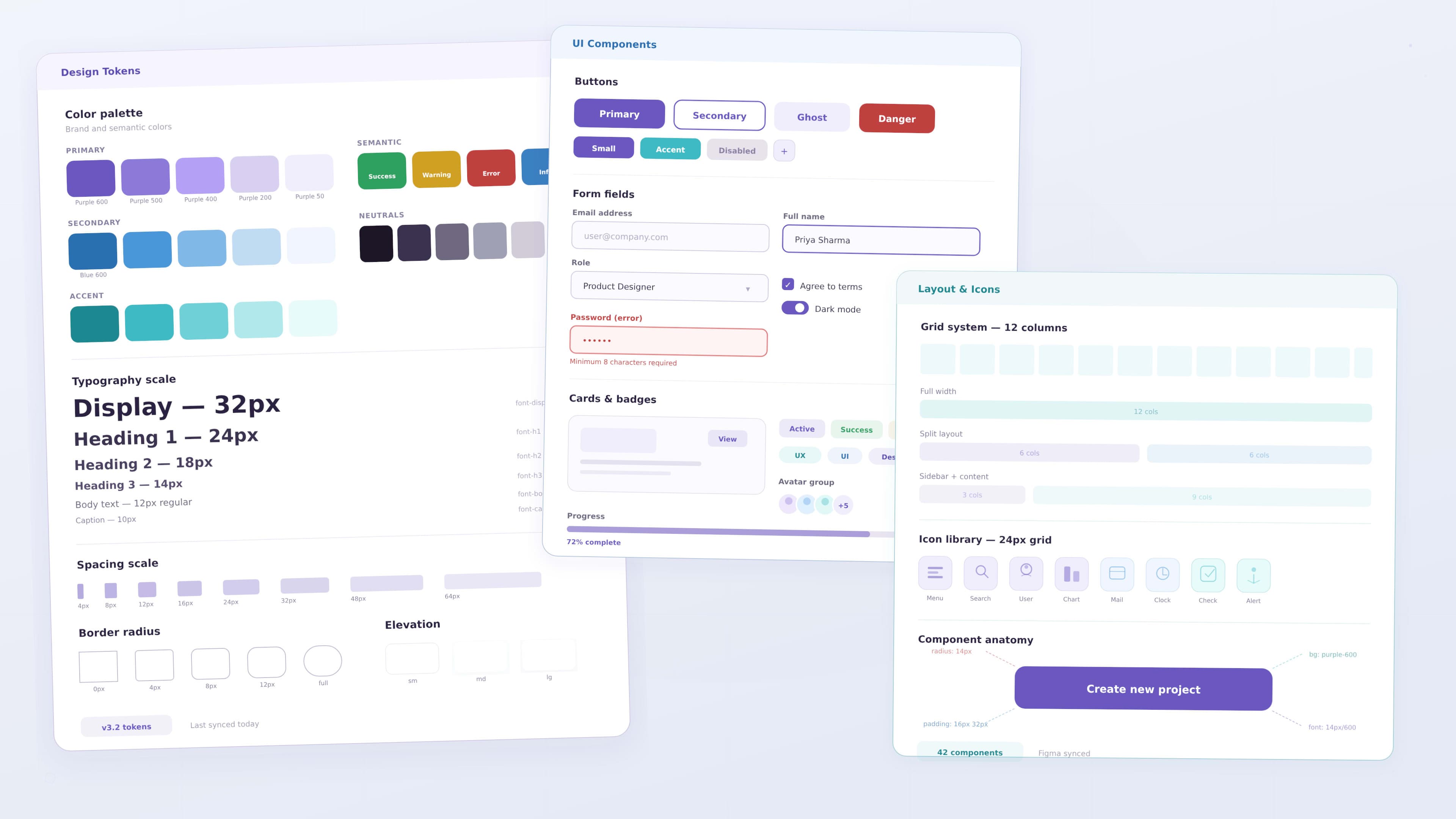
Core Elements of a Design System
A strong design system includes several foundational elements that guide product design.
Visual Foundations
Visual foundations define the overall visual identity of the product.
These include:
- color palette
- typography styles
- spacing rules
- grid systems
- iconography
These foundations ensure the product maintains a consistent visual language across all screens.
For example, a design system may define primary brand colors, typography scales, and spacing values that designers use throughout the interface.
UI Components
Components are reusable interface elements used across multiple parts of a product.
Instead of redesigning these elements repeatedly, designers create standardized components.
Common components include:
- buttons
- input fields
- dropdown menus
- navigation bars
- cards
- modals
- alerts
Reusable components help maintain visual consistency while speeding up the design process.
Layout and Grid Systems
Layout systems help organize content consistently across different screens.
A grid system defines how elements align and how spacing is applied across layouts.
Layout guidelines often include:
- column structures
- spacing rules
- responsive breakpoints
- alignment standards
Grid systems help create interfaces that feel structured and organized.
Interaction Patterns
Interaction patterns define how users interact with interface elements.
These patterns include behaviors such as:
- hover states
- focus states
- loading indicators
- button interactions
- error messages
Defining interaction patterns ensures consistent behavior across the entire product.
Documentation
Documentation is one of the most critical parts of a design system.
Documentation explains:
- how components should be used
- when to use specific patterns
- design principles and guidelines
- implementation examples for developers
Without clear documentation, teams may misuse components or create inconsistencies.
Good documentation ensures both designers and developers understand how to use the design system effectively.
Design Tokens in Design Systems
Design tokens represent the smallest design decisions within a design system.
They store visual values such as:
- colors
- typography sizes
- spacing values
- shadows
- border radius
Instead of repeating design values across components, tokens store these values centrally.
For example, a color token may define the primary brand color used throughout the interface.
If the brand color changes, updating the token automatically updates all components that use it.
Design tokens help maintain consistency while simplifying design updates.
Component States
UI components rarely exist in only one state. They often change depending on how users interact with them.
A well designed system defines different states for each component.
Common states include:
- default state
- hover state
- active state
- focus state
- disabled state
- loading state
For example, a button may change color when a user hovers over it or when it is disabled.
Defining these states ensures consistent interaction behavior across the product.
Accessibility in Design Systems
Accessibility should be integrated into the design system from the beginning.
When accessibility guidelines are embedded within the system, teams ensure that all components follow inclusive design standards.
Accessibility considerations include:
- sufficient color contrast
- readable typography
- keyboard navigation support
- visible focus indicators
- screen reader compatibility
Embedding accessibility within the design system helps ensure interfaces remain usable for a wider audience.
How Design Systems Improve Collaboration
One of the biggest advantages of design systems is improved collaboration between designers and developers.
Without a design system, developers often interpret design files manually.
This can lead to inconsistencies during implementation.
Design systems provide a shared language between design and development teams.
Designers create standardized components, and developers implement those components in code.
This alignment ensures the final product matches the design specifications.
Tools Used for Building Design Systems
Modern product teams rely on specialized tools to build and maintain design systems.
Some commonly used tools include:
- Figma for creating component libraries
- Storybook for documenting UI components in development
- Zeroheight for design system documentation
- Front-end frameworks for reusable components
These tools help designers and developers collaborate effectively.
Building a Design System
Creating a design system involves several key steps.
1 Identify Reusable Patterns
The first step is identifying UI patterns that appear repeatedly across the product.
Examples include:
- buttons
- form inputs
- navigation menus
- layout structures
These patterns become the foundation for reusable components.
2 Define Visual Foundations
Next, teams define the visual identity of the system.
This includes:
- colors
- typography
- spacing
- grid systems
These foundations guide all UI components.
3 Create UI Components
Designers then build reusable UI components based on the identified patterns.
Each component should include:
- visual states
- interaction behavior
- usage guidelines
4 Document Usage Guidelines
Clear documentation ensures teams understand when and how to use components.
5 Collaborate with Developers
Developers implement components within code libraries so the design system can be used across the product.
Governance of Design Systems
Design systems require governance to remain effective.
Governance defines how the system evolves and who is responsible for maintaining it.
Important governance practices include:
- assigning system maintainers
- reviewing new components before adding them
- documenting updates
- gathering feedback from product teams
Without governance, design systems may become fragmented over time.
Encouraging Design System Adoption
A design system only succeeds if teams actively use it.
Teams can encourage adoption by:
- providing clear documentation
- making components easy to access
- integrating the system into design tools
- educating teams about its benefits
Training sessions and internal resources can also help teams adopt the system effectively.
Real World Examples of Design Systems
Many leading technology companies rely on design systems.
Examples include:
- Google Material Design
- IBM Carbon Design System
- Microsoft Fluent Design System
- Shopify Polaris
These systems provide extensive guidelines, components, and documentation that support large scale product development.
Studying these systems can help teams understand how to build scalable design systems.
Design Systems and Product Scalability
As products grow, design systems play a crucial role in maintaining scalability.
Without a design system, new features may introduce inconsistent UI patterns.
Design systems allow teams to expand products efficiently because they already have:
- reusable UI components
- standardized interaction patterns
- consistent visual foundations
This structure allows teams to build new features faster while maintaining product consistency.
Performance Considerations
Design systems also influence product performance.
Reusable components reduce redundant code and simplify front end development.
Using standardized components helps teams:
- reduce development complexity
- improve maintainability
- ensure consistent behavior across interfaces
These improvements contribute to faster and more reliable digital products.
Future of Design Systems
Design systems continue to evolve as digital products become more complex.
Future trends include:
- automated design tokens
- AI assisted component generation
- cross platform design systems
- stronger integration between design and development tools
As organizations scale their digital products, design systems will become even more important.
Key Takeaways
Design systems provide structure and consistency for modern product teams.
Important benefits include:
- consistent user interfaces
- faster design workflows
- improved collaboration between designers and developers
- scalable product design
Teams that invest in design systems can build better products more efficiently.
Conclusion
Design systems play a critical role in building scalable digital products. By defining reusable components, visual standards, and documentation, teams can maintain consistency while improving design and development efficiency.
For modern product teams, adopting a design system is no longer optional. It is an essential part of building reliable, scalable, and user friendly digital experiences.