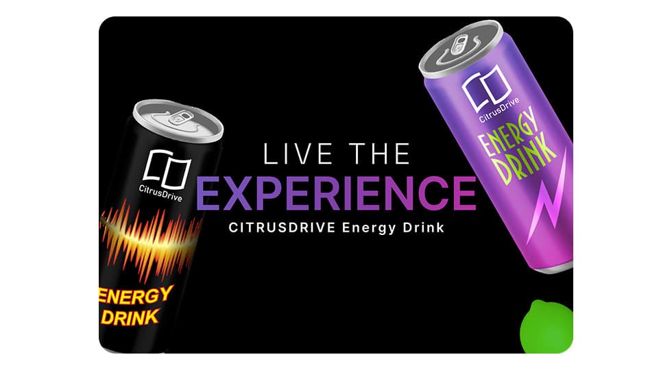
Website

CitrusDrive Energy Drink Landing Page Design

Modern product landing page designed to showcase CitrusDrive energy drinks with bold visuals, strong branding, and conversion-focused CTAs to drive product discovery and purchases.

WebsiteUX/UIConversion Optimization
CitrusDrive Energy Drink Landing Page Design - UI/UX design case study by Saurabh Pansari

1. Overview & Problem

Project Overview

CitrusDrive is a conceptual energy drink brand aimed at young professionals, gamers, and active individuals who need an instant energy boost.

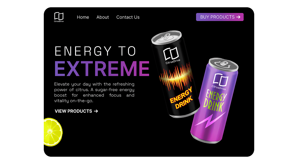
The goal of this project was to design a modern landing page that visually communicates the brand’s energetic personality while encouraging users to explore and purchase the product.

Problem Statement

Many beverage product websites rely heavily on static layouts and fail to create an engaging visual experience.

The challenge was to design a landing page that instantly captures attention, highlights the product, and encourages users to take action while maintaining a clean and modern UI.

2. Goals & Target Audience

Goals

The primary goal was to create a visually striking landing page that introduces the CitrusDrive brand and drives product exploration.

The design needed to clearly communicate the product benefits, maintain strong branding, and guide users toward purchasing the energy drink.

Target Audience

The product primarily targets young adults, gamers, fitness enthusiasts, and professionals who require quick energy boosts during work, gaming, or workouts.

These users value bold visuals, fast access to product information, and a seamless browsing experience.

3. Information Architecture & Navigation

Information Architecture

The landing page follows a simple and focused structure designed for quick product discovery.

Users are first introduced to the brand through a bold hero section, followed by product highlights and navigation links for further exploration.

Navigation Structure

The top navigation includes essential sections such as Home, About, and Contact.

A prominent call-to-action button encourages users to directly view and purchase products, helping streamline the conversion flow.

4. Design Strategy

Design Approach

The design focuses on creating a high-energy visual experience through bold typography, vibrant gradients, and dynamic product imagery.

A dark background was used to enhance contrast and allow the product colors to stand out prominently.

Visual Direction

Gradient accents, neon-style highlights, and strong typography reinforce the energetic personality of the brand.

The design balances strong visual impact with clean layout structure to maintain clarity and usability.

5. Visual Design & Key Screens

Visual Design

The visual style uses a dark background with purple and neon gradient highlights to represent energy and intensity.

Product cans are presented with dynamic angles to create motion and visual interest, while citrus elements reinforce the refreshing nature of the drink.

Key Screens

The hero section introduces the CitrusDrive brand with a bold headline and a strong visual focus on the product cans.

The product highlight section emphasizes the benefits of the drink and encourages users to explore available options.

Clear call-to-action buttons guide users toward viewing products or making a purchase.

Visual Design & Key Screens 1
Visual Design & Key Screens 2

6. Impact & Learnings

Outcomes

The final design successfully delivers a bold and engaging product landing experience that aligns with the energetic brand identity of CitrusDrive.

The use of dynamic visuals and strong CTAs helps guide users toward exploring and purchasing the product.

Key Learnings

This project reinforced the importance of visual storytelling in product marketing websites.

Balancing strong visual design with clear information hierarchy ensures the interface remains both engaging and easy to navigate.

7. Figma Prototype Embed