Tagline: Designing a modern product landing page experience for a smart home device.
Role: UI/UX Designer
Timeline: 2 Days
Tools: Figma
Designed a modern product landing page interface for Amazon Echo that highlights the smart home experience through clean layout, strong typography, and product-focused visual hierarchy.

Tagline: Designing a modern product landing page experience for a smart home device.
Role: UI/UX Designer
Timeline: 2 Days
Tools: Figma
This project focuses on designing a clean and modern landing page interface for the Amazon Echo smart speaker.
The goal was to highlight the product's smart home capabilities while maintaining a minimal and product-focused design approach.
The interface introduces the device through a strong headline, product imagery, and a clear call-to-action encouraging users to explore or purchase the product.
Many product landing pages struggle with balancing product information and visual presentation.
For smart devices like Amazon Echo, the interface should communicate innovation, simplicity, and trust while keeping the product as the main visual focus.
The objective was to create a visually clean landing page that highlights the product while communicating its smart home capabilities.
The design needed to guide users toward understanding the product quickly and encourage them to take action through a clear call-to-action.
The interface targets users interested in smart home technology and voice-controlled devices.
These users are typically looking for simple explanations of features and a clear path to purchase or explore the product.
The design approach focuses on a minimal product-centered layout where the device becomes the primary visual element.
Large typography introduces the product concept while supporting text explains the benefits of voice-controlled smart home technology.
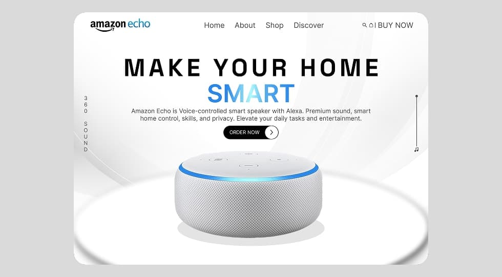
Users land on the hero section where the product is immediately visible.
The interface guides users toward the primary action button which allows them to order the device.
Additional visual elements such as scroll indicators and navigation help users explore further sections of the product page.
The layout is structured around a central product showcase.
The hero section includes navigation, headline, supporting description, and a call-to-action button.
The product image sits at the center of the screen, creating a strong visual focal point.
The visual design uses a minimal color palette of white, grey, and blue accents to represent modern technology.
Soft gradients and circular lighting effects help create a futuristic environment around the device.
The landing page hero screen introduces the Amazon Echo product with a strong headline and call-to-action.
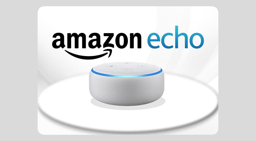
A secondary screen emphasizes the product branding and visual focus on the smart speaker device.
The final interface presents the Amazon Echo as a modern smart home device through a clean and product-focused design.
The layout emphasizes clarity, visual hierarchy, and strong product presentation.
Designing product landing pages requires strong visual hierarchy and minimal distractions.
Highlighting the product with clear messaging and simple layouts helps users quickly understand the value of the product.
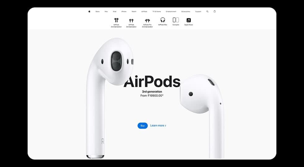
Designed a modern product showcase experience inspired by Apple’s website, focusing on visuals, product comparisons, and smooth scroll-based interactions to highlight different AirPods models.
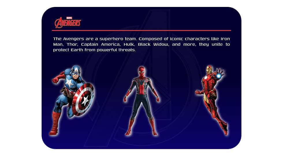
Designed an interactive Avengers-themed website where users can explore superheroes and view detailed character profiles through a dynamic character selection interface.

Designed a gaming-themed landing page for an esports team where users can explore the team, view individual players, and join the gaming community.
Discover the core UI design principles that help designers create visually clear, consistent, and effective digital interfaces.
Discover practical dashboard UX design principles that help designers present complex data clearly and improve user decision making.