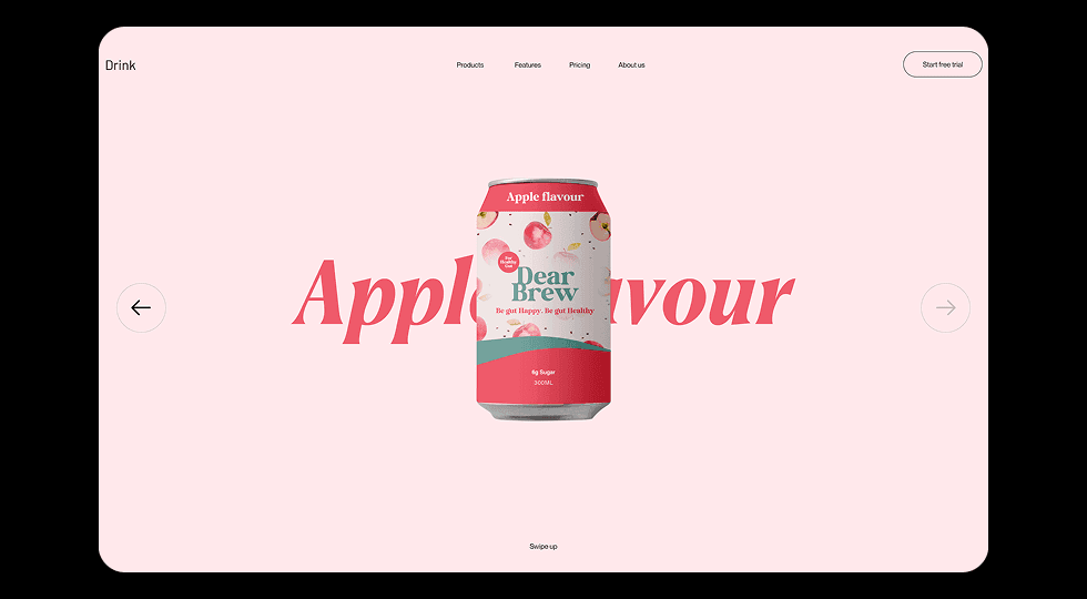
Website

Drink 3D Rotation Product Experience

Designed an interactive beverage product showcase featuring 3D rotation and flavor-based transitions to create an engaging product exploration experience.

Web DesignProduct Showcase3D InteractionUI Animation
Drink 3D Rotation Product Experience - UI/UX design case study by Saurabh Pansari

1. Overview & Problem Statement

Project Overview

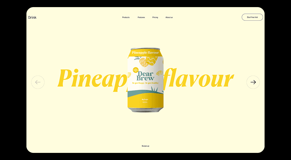
This project explores an interactive product showcase for a beverage brand where users can explore different drink flavors through dynamic transitions and rotating product visuals.

The design focuses on combining product presentation with motion-based interaction to create a more engaging browsing experience.

Problem Statement

Many beverage product pages rely on static product images that fail to fully showcase the product or capture user attention.

The challenge was to design a more interactive product experience where users can explore flavors through motion, visual transitions, and product-focused storytelling.

2. Goals & Target Audience

Goals

The primary goal was to design a visually engaging product experience that highlights different drink flavors through color, typography, and motion.

The design also aims to create a playful and memorable browsing experience that encourages users to explore multiple product options.

Target Audience

The interface targets young consumers, lifestyle-focused audiences, and beverage enthusiasts who enjoy exploring new drink products.

The design also appeals to brands that want to present their products in a modern and interactive way.

3. Information Architecture & Navigation

Information Architecture

The landing page focuses on the product as the main visual element while supporting navigation allows users to explore different product sections such as features, pricing, and collections.

Flavor variations are presented through a carousel-like structure that allows users to switch between products.

Navigation Structure

A minimal navigation bar includes links to Products, Features, Pricing, and About sections.

A clear call-to-action button such as “Start Free Trial” encourages users to explore the product offering further.

4. Design Strategy

Design Approach

The design emphasizes the product as the hero element while using large typography and color transitions to highlight flavor variations.

Each flavor variation introduces a unique background tone that reinforces the identity of the drink.

Visual Direction

Soft pastel backgrounds and bold typography create a fresh and playful aesthetic that reflects a modern beverage brand.

The layout remains minimal to ensure that the product visuals remain the focal point of the interface.

5. Visual Design & Key Screens

Visual Design

The interface uses large background typography combined with a centered product visual to create strong visual impact.

Color palettes change based on the flavor being displayed, reinforcing the product identity.

Key Screens

The hero section showcases the beverage can with large flavor typography in the background.

Users can navigate between different drink flavors such as pineapple and apple through directional controls placed on the sides of the screen.

Visual Design & Key Screens 1
Visual Design & Key Screens 2

6. Interaction & Learnings

Interaction Design

The product can rotates in 3D as users switch between flavors, creating a dynamic and immersive browsing experience.

Background colors and typography transition smoothly when the flavor changes, reinforcing the identity of each product variation.

Key Learnings

This project highlighted how motion and micro-interactions can transform a simple product showcase into an engaging visual experience.

Using color transitions and 3D motion can help brands create stronger product identity and improve user engagement.

7. Figma Prototype Embed