Tagline: Designing a simple and motivating savings dashboard that helps users track their digital gold investments.
Role: UI/UX Designer
Timeline: 2 Days
Tools: Figma
Designed a mobile dashboard screen for a digital gold savings app that helps users track savings, monitor gold value, and perform actions like saving or withdrawing funds.
Tagline: Designing a simple and motivating savings dashboard that helps users track their digital gold investments.
Role: UI/UX Designer
Timeline: 2 Days
Tools: Figma
This project explores the design of a mobile dashboard screen for a digital gold savings application.
The interface helps users track their savings value while converting it into digital gold units. The screen highlights total savings, gold value conversion, and quick actions for saving or withdrawing money.
The goal was to create a clear financial overview that motivates users to continue saving while providing quick access to key financial actions.
Many savings and investment apps present financial data in complex dashboards that can overwhelm users.
For new investors, understanding savings value, investment growth, and financial actions can feel confusing.
The challenge was to design a clean and approachable financial dashboard that communicates savings information clearly while encouraging users to continue investing.
The design focused on creating a clear financial overview that helps users quickly understand their savings.
Key goals included making savings information highly visible, presenting gold conversion values clearly, and providing simple action buttons for saving or withdrawing funds.
The interface is designed for individuals who want to save money in digital gold through a mobile application.
Users are typically young professionals and new investors who want a simple way to track savings and gradually build wealth.
They expect a clear overview of their savings balance and easy access to actions such as saving more money or withdrawing funds.
The design approach focused on simplicity and motivation.
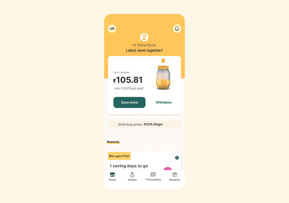
A large savings card was placed at the center of the interface to highlight the user's total savings value.
The gold jar illustration visually represents the concept of digital gold savings and helps make the interface more engaging.
Action buttons were positioned prominently to encourage users to continue saving or manage their funds.
The screen follows a simple vertical hierarchy.
The top section greets the user and reinforces the savings goal.
The middle section contains the primary savings card showing the current savings value and gold conversion.
Below the main card, additional sections present gold pricing information and reward incentives.
The bottom navigation bar provides access to key sections of the app such as home, savings accounts, transactions, and rewards.
The visual design uses warm gold and beige tones to reinforce the theme of financial savings and gold investment.
A jar filled with gold coins is used as a visual metaphor for saving money.
Rounded cards and soft shadows create a friendly and approachable fintech interface while maintaining a modern mobile design style.

The dashboard includes several important UI elements that improve usability.
The savings card displays the user's total savings value and the equivalent gold weight.
Primary action buttons allow users to quickly save more money or withdraw their investment.
The gold price section informs users about the current gold purchase rate.
Reward cards motivate users to continue saving by offering incentives and progress indicators.
The final design presents financial information in a clean and motivating dashboard format.
Users can quickly understand their savings value, see the equivalent gold investment, and perform key financial actions without navigating through complex menus.
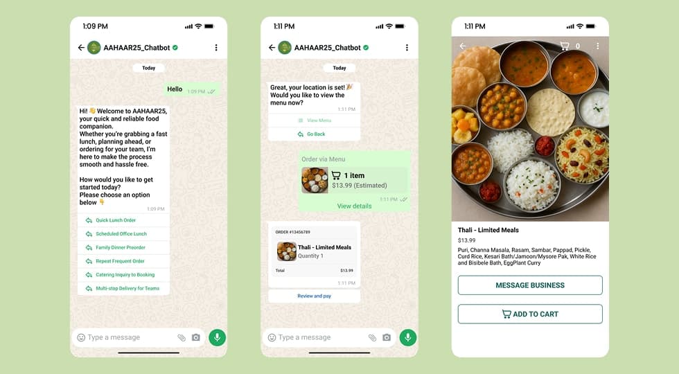
A WhatsApp-based chatbot designed to streamline food ordering and provide real-time assistance for event visitors at AAHAAR25.
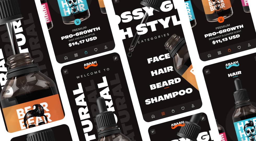
A modern mobile e-commerce concept designed for men’s grooming products, focusing on bold product visuals, category-driven browsing, and a premium shopping experience.
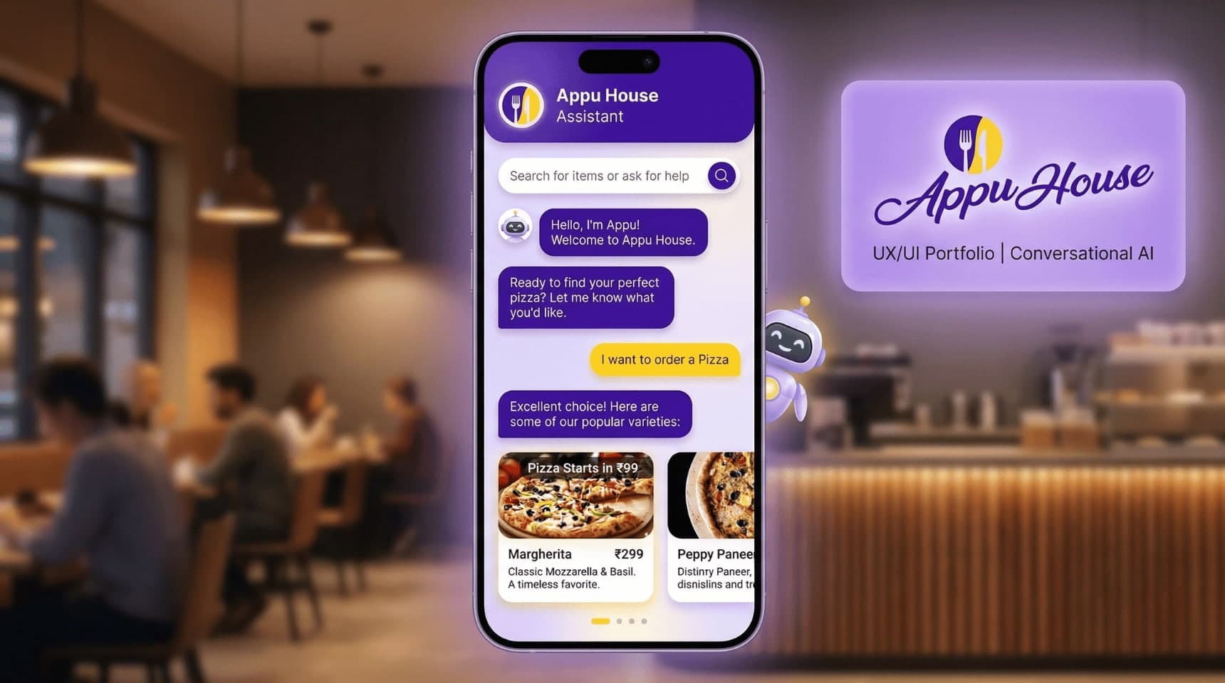
Designed a conversational food-ordering chatbot for Appu House Cafe, simplifying menu discovery and ordering through a chat-based interface to improve ordering speed and user engagement.