Tagline
Improving the digital experience for athletes to explore training programs and memberships.
Role
UI/UX Designer
Timeline
3 Weeks
Tools
Figma, FigJam
Redesigned the ProTech Training website to improve program discovery, pricing clarity, and conversion through a modern layout, structured program sections, and improved visual hierarchy.

Tagline
Improving the digital experience for athletes to explore training programs and memberships.
Role
UI/UX Designer
Timeline
3 Weeks
Tools
Figma, FigJam
ProTech Training is a sports performance training platform that offers athletes structured programs including group sessions, private training, and specialized skill development.
The original website presented training programs and memberships but lacked clear hierarchy and modern structure. Users struggled to quickly understand available training options and pricing plans.
The redesign focused on creating a clear program structure, better pricing visibility, and an engaging sports-focused visual experience.
The original website had several usability issues that made it difficult for users to quickly explore available training programs.
Key problems included:
• Training programs were not clearly categorized
• Pricing information was difficult to compare
• Visual hierarchy between sections was weak
• Program discovery required excessive scrolling and searching
These issues reduced clarity for new visitors and could negatively impact membership conversions.
The redesign aimed to improve both usability and conversion by restructuring the website experience.
Primary objectives included:
• Improve program discovery and navigation
• Clearly present training program categories
• Simplify membership pricing comparison
• Create a modern sports-focused visual experience
• Increase engagement with training programs
• Student athletes looking to improve performance
• Amateur and professional athletes seeking structured training
• Parents looking for sports training programs for their children
• Coaches evaluating training programs
• Understand training programs quickly
• Compare membership pricing easily
• Explore training session types
Analysis of sports training websites and user behavior revealed several insights.
Athletes typically want to quickly answer three questions when visiting a training website:
To support this behavior, the redesigned layout focused on clear program sections, visible pricing tiers, and structured content hierarchy.
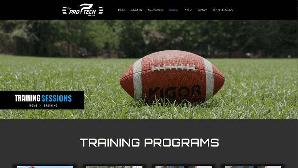
The redesigned structure focused on organizing training programs into clear categories.
Main structure:
Home
↓
Training Programs
• Group + Private Sessions
• Group Sessions
• Private Sessions
• 1-on-1 Training
Membership Pricing
↓
Training Gallery
↓
Contact & Registration
This structure allows users to quickly navigate between program types and pricing plans.
The redesign followed three key design principles.
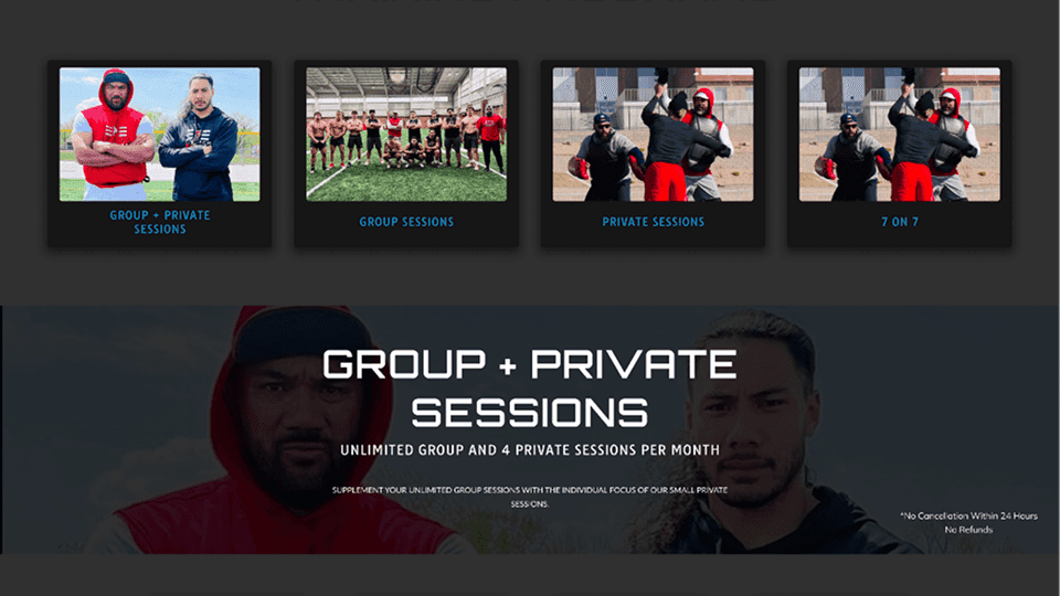
Training sessions were grouped into clear categories so users could easily identify the program that fits their needs.
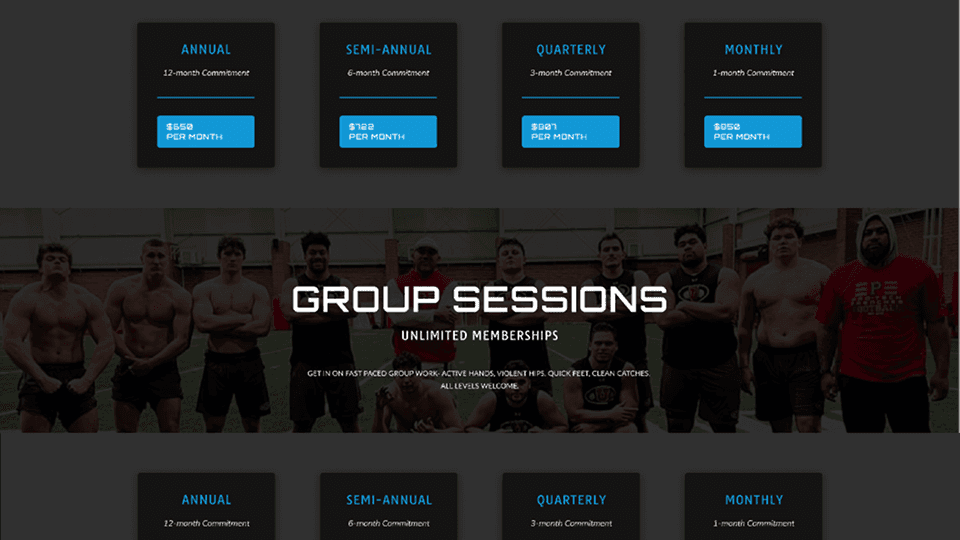
Membership plans were displayed in structured pricing cards to make comparisons easier.
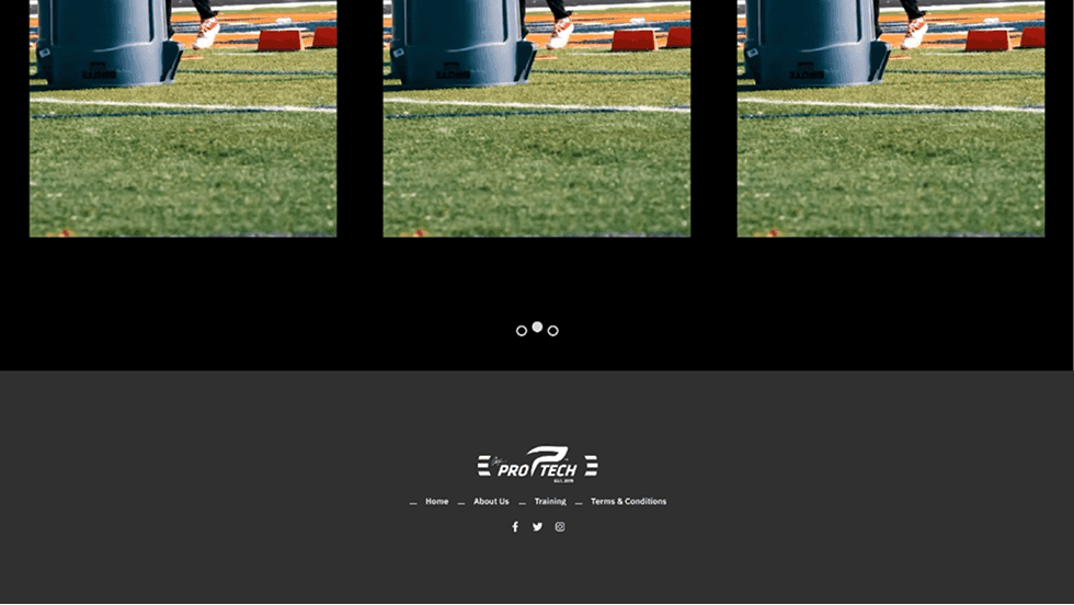
Athlete imagery and training photos were used to create an energetic and professional brand experience.
Early wireframes focused on restructuring the training programs page to improve readability.
Key layout explorations included:
• Program category cards
• Pricing membership tables
• Large hero sections with training imagery
• Section-based content hierarchy
These wireframes helped establish a consistent layout pattern across the page.
The visual design uses a dark theme combined with bold sports imagery to create a high-performance brand feel.
Black and dark gray backgrounds were used to create contrast.
Blue accents highlight interactive elements such as buttons and pricing selections.
Bold uppercase headings emphasize key sections such as training programs and membership plans.
Reusable UI components include:
• Program cards
• Membership pricing cards
• Section hero banners
• CTA buttons
Displays available training categories including group sessions, private sessions, and 1-on-1 coaching.
Provides pricing tiers including monthly, quarterly, semi-annual, and annual plans.
Each training category is presented with a clear hero image and pricing cards.
Athlete training images help communicate the intensity and professionalism of the program.
The redesigned training page creates a more structured and engaging experience for users.
Key improvements include:
• Clearer presentation of training programs
• Easier comparison of membership pricing
• Stronger visual engagement through sports imagery
The redesign helps users quickly understand available programs and encourages membership sign-ups.
One challenge was balancing large visual imagery with structured content sections.
Sports websites often rely heavily on visuals, but clear program information and pricing must remain easy to scan.
This project reinforced the importance of combining visual storytelling with structured information architecture to improve usability.

Designed a modern product landing page interface for Amazon Echo that highlights the smart home experience through clean layout, strong typography, and product-focused visual hierarchy.

Designed a modern product showcase experience inspired by Apple’s website, focusing on visuals, product comparisons, and smooth scroll-based interactions to highlight different AirPods models.
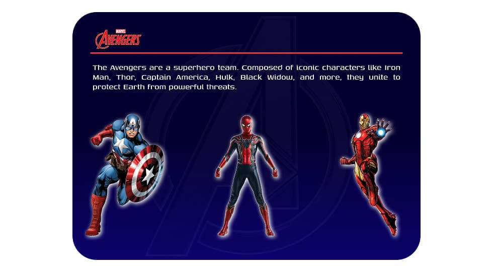
Designed an interactive Avengers-themed website where users can explore superheroes and view detailed character profiles through a dynamic character selection interface.