Data Visualization UX Principles for Modern Dashboards
Modern digital products generate enormous amounts of data. From analytics platforms and SaaS dashboards to enterprise reporting tools, organizations rely on data to understand performance and guide decision making.
However, raw data alone is rarely useful. Without proper visualization, large datasets can overwhelm users and make insights difficult to interpret.
This is where data visualization becomes critical.
Data visualization transforms complex information into visual representations that help users quickly understand patterns, trends, and insights.
For UX designers, the goal of data visualization is not simply to display data but to communicate information clearly and support decision making.
This guide explores the core UX principles that help designers create effective and user friendly data visualizations for modern dashboards.
Why Data Visualization Matters in UX
Users often interact with dashboards when they need to make decisions quickly.
For example:
- managers monitoring performance metrics
- analysts exploring data trends
- executives reviewing business performance
- operations teams tracking system activity
In these situations, users do not want to interpret large tables of numbers.
Instead, they need clear visual representations that highlight the most important insights.
Effective data visualization helps users:
- identify patterns quickly
- understand relationships between metrics
- detect anomalies in data
- make informed decisions
Good data visualization turns complex datasets into clear insights.
Without thoughtful design, dashboards can become cluttered and confusing.
Understanding the User’s Data Goals
Before designing visualizations, designers must understand what users want to learn from the data.
Different users may have different goals.
For example:
- executives want high level summaries
- analysts want detailed exploration
- managers want operational insights
Designers should ask questions such as:
- What decisions will users make based on this data
- What metrics are most important
- What patterns should users identify
Understanding these goals helps designers choose the right visualization approach.
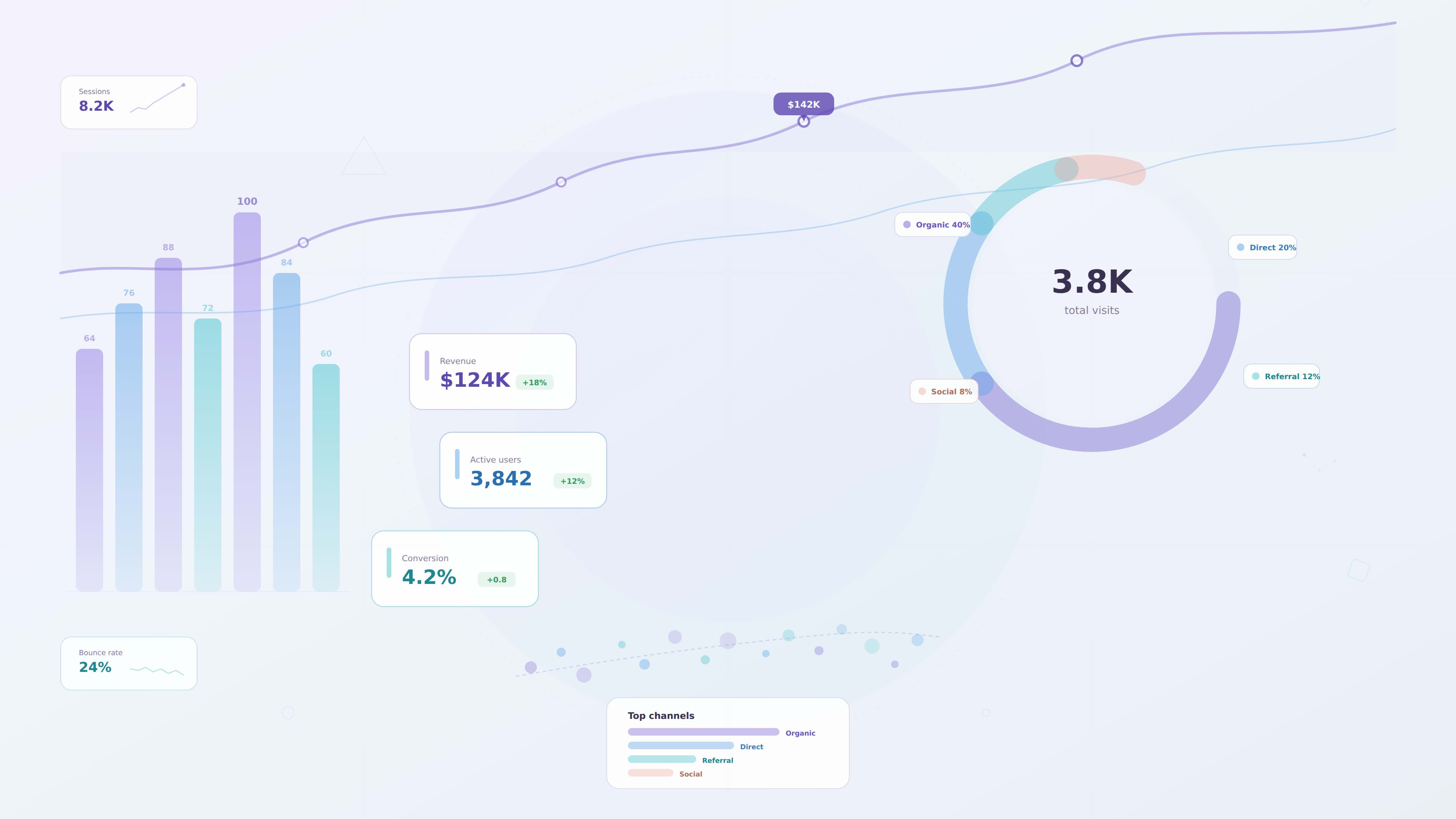
Choosing the Right Chart Type
One of the most important decisions in data visualization is selecting the correct chart.
Different charts communicate different types of information.
Common chart types include:
Line Charts
Line charts are useful for showing trends over time.
Examples include:
- revenue growth
- user engagement trends
- website traffic patterns
Bar Charts
Bar charts are ideal for comparing categories.
Examples include:
- sales by region
- product performance
- department metrics
Pie Charts
Pie charts show proportional relationships.
They are best used when comparing a small number of categories.
Tables
Tables are useful when users need to view detailed data.
However, they should be used carefully since large tables can overwhelm users.
Choosing the right chart ensures data remains easy to understand.
Reducing Visual Clutter
A common mistake in dashboard design is displaying too many charts and metrics on a single screen.
When dashboards become cluttered, users struggle to find meaningful insights.
Designers should reduce clutter by:
- prioritizing key metrics
- grouping related data
- removing unnecessary decorative elements
- simplifying chart styles
Clean visualizations allow users to focus on the most important information.
Creating Strong Visual Hierarchy
Visual hierarchy helps guide users toward the most important insights.
Designers can establish hierarchy through:
- size of elements
- placement within the layout
- color emphasis
- spacing between sections
For example:
- key performance indicators may appear as large metric cards
- supporting charts appear below them
- detailed tables appear further down the interface
This structure helps users quickly scan the dashboard.
Using Color Effectively
Color plays an important role in data visualization.
It helps users identify patterns, categories, and changes in data.
However, color should be used carefully.
Best practices include:
- using a limited color palette
- maintaining consistent color meanings
- highlighting important metrics with accent colors
- ensuring sufficient color contrast
Designers should avoid relying only on color to communicate information, since some users may have color vision deficiencies.
Labeling Data Clearly
Charts must include clear labels so users understand what the data represents.
Important labeling elements include:
- chart titles
- axis labels
- legends explaining colors
- tooltips with additional details
Clear labeling prevents confusion and improves data interpretation.
Providing Context for Data
Data without context can be misleading.
Users need additional information to understand what numbers actually mean.
Designers can provide context by:
- comparing current values with previous periods
- highlighting trends over time
- showing benchmarks or targets
- explaining unusual patterns
Context allows users to interpret insights more accurately.
Supporting Data Exploration
Many dashboards require interactive features that allow users to explore data.
Interactive features may include:
- filters for selecting time ranges
- drill down interactions
- tooltips showing detailed values
- sorting options for comparing metrics
These interactions allow users to investigate insights without overwhelming the interface.
Accessibility in Data Visualization
Accessible data visualization ensures charts remain understandable for all users.
Accessibility considerations include:
- sufficient color contrast
- alternative text for charts
- clear labeling
- patterns or icons in addition to color coding
Accessible visualizations improve usability for a wider audience.
Performance Considerations
Large datasets can impact dashboard performance.
Designers should consider strategies that reduce performance issues.
These strategies may include:
- summarizing data with KPI cards
- loading data progressively
- allowing users to filter data before loading large datasets
Performance optimization ensures dashboards remain responsive.
Example: Improving an Analytics Dashboard
Imagine an analytics dashboard used by marketing teams to track campaign performance.
The original dashboard contains many charts with equal visual emphasis.
Users struggle to identify which metrics matter most.
A UX designer could improve the dashboard by:
1 highlighting key metrics at the top
2 simplifying chart types
3 grouping related data sections
4 reducing unnecessary visual elements
These changes improve clarity and help users focus on important insights.
Common Data Visualization Mistakes
Even experienced designers sometimes create visualizations that reduce usability.
Common mistakes include:
- using complex or unfamiliar chart types
- displaying too many metrics
- inconsistent color usage
- unclear labels
- decorative charts that add no value
Avoiding these mistakes helps maintain clarity.
Future Trends in Data Visualization
Data visualization continues to evolve as technology advances.
Emerging trends include:
- real time analytics dashboards
- interactive data exploration tools
- AI driven insights
- advanced visualization libraries
As dashboards become more sophisticated, designers must focus on clarity and usability.
Key Takeaways
Effective data visualization helps users interpret complex data quickly.
Important principles include:
- understanding user goals
- choosing appropriate chart types
- reducing visual clutter
- establishing visual hierarchy
- using color carefully
- providing context for data
Designers who follow these principles create dashboards that support better decision making.
Conclusion
Data visualization is a critical part of modern dashboard design. When complex information is presented clearly, users can identify patterns, understand performance, and make informed decisions.
By applying strong UX principles to data visualization, designers can transform raw data into meaningful insights that help organizations operate more effectively.# Data Visualization UX Principles for Modern Dashboards
Modern digital products generate enormous amounts of data. From analytics platforms and SaaS dashboards to enterprise reporting tools, organizations rely on data to understand performance and guide decision making.
However, raw data alone is rarely useful. Without proper visualization, large datasets can overwhelm users and make insights difficult to interpret.
This is where data visualization becomes critical.
Data visualization transforms complex information into visual representations that help users quickly understand patterns, trends, and insights.
For UX designers, the goal of data visualization is not simply to display data but to communicate information clearly and support decision making.
This guide explores the core UX principles that help designers create effective and user friendly data visualizations for modern dashboards.
Why Data Visualization Matters in UX
Users often interact with dashboards when they need to make decisions quickly.
For example:
- managers monitoring performance metrics
- analysts exploring data trends
- executives reviewing business performance
- operations teams tracking system activity
In these situations, users do not want to interpret large tables of numbers.
Instead, they need clear visual representations that highlight the most important insights.
Effective data visualization helps users:
- identify patterns quickly
- understand relationships between metrics
- detect anomalies in data
- make informed decisions
Good data visualization turns complex datasets into clear insights.
Without thoughtful design, dashboards can become cluttered and confusing.
Understanding the User’s Data Goals
Before designing visualizations, designers must understand what users want to learn from the data.
Different users may have different goals.
For example:
- executives want high level summaries
- analysts want detailed exploration
- managers want operational insights
Designers should ask questions such as:
- What decisions will users make based on this data
- What metrics are most important
- What patterns should users identify
Understanding these goals helps designers choose the right visualization approach.
Choosing the Right Chart Type
One of the most important decisions in data visualization is selecting the correct chart.
Different charts communicate different types of information.
Common chart types include:
Line Charts
Line charts are useful for showing trends over time.
Examples include:
- revenue growth
- user engagement trends
- website traffic patterns
Bar Charts
Bar charts are ideal for comparing categories.
Examples include:
- sales by region
- product performance
- department metrics
Pie Charts
Pie charts show proportional relationships.
They are best used when comparing a small number of categories.
Tables
Tables are useful when users need to view detailed data.
However, they should be used carefully since large tables can overwhelm users.
Choosing the right chart ensures data remains easy to understand.
Reducing Visual Clutter
A common mistake in dashboard design is displaying too many charts and metrics on a single screen.
When dashboards become cluttered, users struggle to find meaningful insights.
Designers should reduce clutter by:
- prioritizing key metrics
- grouping related data
- removing unnecessary decorative elements
- simplifying chart styles
Clean visualizations allow users to focus on the most important information.
Creating Strong Visual Hierarchy
Visual hierarchy helps guide users toward the most important insights.
Designers can establish hierarchy through:
- size of elements
- placement within the layout
- color emphasis
- spacing between sections
For example:
- key performance indicators may appear as large metric cards
- supporting charts appear below them
- detailed tables appear further down the interface
This structure helps users quickly scan the dashboard.
Using Color Effectively
Color plays an important role in data visualization.
It helps users identify patterns, categories, and changes in data.
However, color should be used carefully.
Best practices include:
- using a limited color palette
- maintaining consistent color meanings
- highlighting important metrics with accent colors
- ensuring sufficient color contrast
Designers should avoid relying only on color to communicate information, since some users may have color vision deficiencies.
Labeling Data Clearly
Charts must include clear labels so users understand what the data represents.
Important labeling elements include:
- chart titles
- axis labels
- legends explaining colors
- tooltips with additional details
Clear labeling prevents confusion and improves data interpretation.
Providing Context for Data
Data without context can be misleading.
Users need additional information to understand what numbers actually mean.
Designers can provide context by:
- comparing current values with previous periods
- highlighting trends over time
- showing benchmarks or targets
- explaining unusual patterns
Context allows users to interpret insights more accurately.
Supporting Data Exploration
Many dashboards require interactive features that allow users to explore data.
Interactive features may include:
- filters for selecting time ranges
- drill down interactions
- tooltips showing detailed values
- sorting options for comparing metrics
These interactions allow users to investigate insights without overwhelming the interface.
Accessibility in Data Visualization
Accessible data visualization ensures charts remain understandable for all users.
Accessibility considerations include:
- sufficient color contrast
- alternative text for charts
- clear labeling
- patterns or icons in addition to color coding
Accessible visualizations improve usability for a wider audience.
Performance Considerations
Large datasets can impact dashboard performance.
Designers should consider strategies that reduce performance issues.
These strategies may include:
- summarizing data with KPI cards
- loading data progressively
- allowing users to filter data before loading large datasets
Performance optimization ensures dashboards remain responsive.
Example: Improving an Analytics Dashboard
Imagine an analytics dashboard used by marketing teams to track campaign performance.
The original dashboard contains many charts with equal visual emphasis.
Users struggle to identify which metrics matter most.
A UX designer could improve the dashboard by:
1 highlighting key metrics at the top
2 simplifying chart types
3 grouping related data sections
4 reducing unnecessary visual elements
These changes improve clarity and help users focus on important insights.
Common Data Visualization Mistakes
Even experienced designers sometimes create visualizations that reduce usability.
Common mistakes include:
- using complex or unfamiliar chart types
- displaying too many metrics
- inconsistent color usage
- unclear labels
- decorative charts that add no value
Avoiding these mistakes helps maintain clarity.
Future Trends in Data Visualization
Data visualization continues to evolve as technology advances.
Emerging trends include:
- real time analytics dashboards
- interactive data exploration tools
- AI driven insights
- advanced visualization libraries
As dashboards become more sophisticated, designers must focus on clarity and usability.
Key Takeaways
Effective data visualization helps users interpret complex data quickly.
Important principles include:
- understanding user goals
- choosing appropriate chart types
- reducing visual clutter
- establishing visual hierarchy
- using color carefully
- providing context for data
Designers who follow these principles create dashboards that support better decision making.
Conclusion
Data visualization is a critical part of modern dashboard design. When complex information is presented clearly, users can identify patterns, understand performance, and make informed decisions.
By applying strong UX principles to data visualization, designers can transform raw data into meaningful insights that help organizations operate more effectively.