Enterprise Dashboard Design Guide for UX Designers
Enterprise dashboards play a critical role in modern digital products. Organizations rely on dashboards to monitor performance, analyze data, and make informed decisions.
From supply chain management systems to analytics platforms and project management tools, dashboards provide visibility into complex business operations.
However, enterprise dashboards often contain large volumes of data. Without thoughtful design, they can become overwhelming and difficult to interpret.
UX designers play a crucial role in transforming complex data into clear, usable interfaces that support decision making.
This guide explores the principles, patterns, and strategies that help designers create effective enterprise dashboards.
Understanding Enterprise Dashboard Users
Enterprise dashboards are often used by multiple roles within an organization.
Each user type may require different insights depending on their responsibilities.
Common dashboard users include:
- executives who monitor high level business performance
- managers who track operational metrics
- analysts who explore detailed data trends
- operational teams who monitor real time activity
Understanding these user roles is essential before designing the dashboard interface.
Designers should identify the key questions each user wants to answer.
For example:
- Is revenue increasing this quarter
- Which regions are performing best
- Are there operational issues that require attention
A successful dashboard answers the most important questions users have.
When designers understand user goals, they can prioritize the most relevant insights.
Defining the Purpose of the Dashboard
Not all dashboards serve the same purpose.
Different dashboards support different types of decisions.
Some common dashboard types include:
Strategic Dashboards
Strategic dashboards provide high level insights for executives and leadership teams.
They typically include:
- business performance metrics
- revenue trends
- key performance indicators
These dashboards focus on long term trends and business outcomes.
Operational Dashboards
Operational dashboards monitor real time activities within an organization.
Examples include:
- supply chain monitoring
- customer support performance
- system performance tracking
Operational dashboards help teams identify issues quickly.
Analytical Dashboards
Analytical dashboards allow users to explore large datasets and identify patterns.
These dashboards often include advanced filtering and data exploration tools.
Understanding the purpose of the dashboard helps designers determine how information should be presented.
Structuring Complex Information
Enterprise dashboards often contain multiple data sources and metrics.
Without proper organization, dashboards can become cluttered and difficult to use.
Designers should structure information carefully.
Effective techniques include:
- grouping related metrics together
- highlighting key performance indicators
- separating sections using visual hierarchy
- reducing unnecessary elements
Clear organization helps users scan the dashboard quickly and locate important insights.
Prioritizing Key Metrics
One of the most common mistakes in dashboard design is displaying too much information.
When every metric appears equally important, users struggle to identify what matters most.
Designers should prioritize key metrics that directly support user goals.
Common prioritization strategies include:
- placing important metrics at the top
- using larger cards for key indicators
- highlighting changes or anomalies
- reducing emphasis on secondary information
Prioritization helps users focus on the insights that require attention.
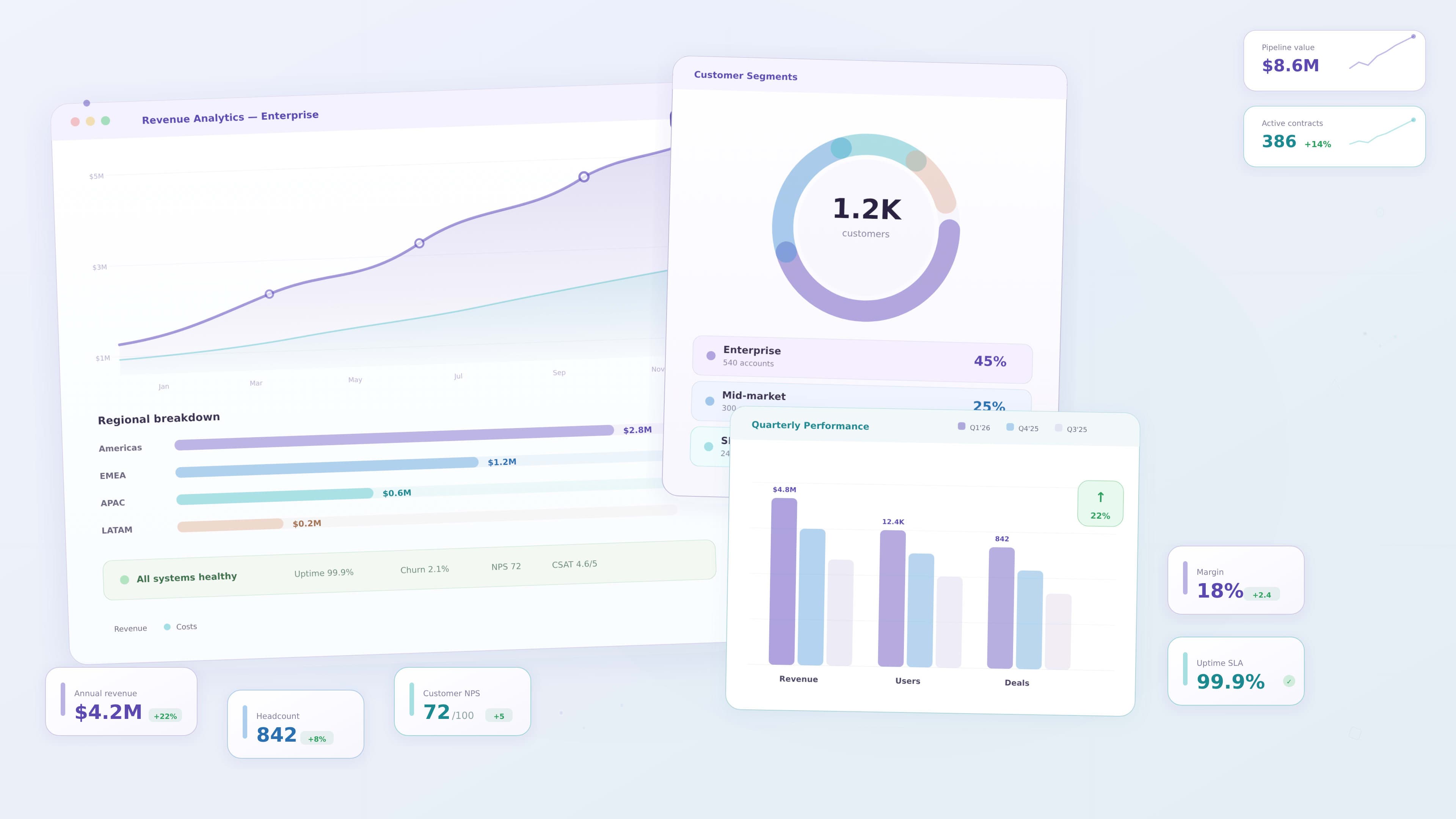
Designing Effective Data Visualizations
Data visualization is one of the most important aspects of dashboard design.
The goal is to help users interpret complex information quickly.
Different chart types serve different purposes.
Common visualization patterns include:
- line charts for trends over time
- bar charts for comparisons
- pie charts for simple proportions
- KPI cards for summary metrics
- tables for detailed data
Designers should select the chart type that best communicates the data story.
Simple visualizations are often more effective than complex ones.
Creating Strong Visual Hierarchy
Visual hierarchy guides users toward the most important information.
Designers can create hierarchy using:
- size
- color
- spacing
- layout
For example:
- large KPI cards highlight key metrics
- charts show supporting insights
- tables provide detailed data
This layered structure helps users move from high level insights to deeper analysis.
Supporting Data Exploration
Enterprise users often need the ability to explore data in more detail.
Dashboards should support this through interactive features.
Examples include:
- filters for selecting data ranges
- drill down interactions
- tooltips explaining data points
- sorting and comparison tools
These features allow users to investigate insights without overwhelming the interface.
Designing Scalable Dashboard Systems
Enterprise products often evolve over time.
New features, data sources, and metrics may be added as the product grows.
Designers should create dashboards that can scale.
Important scalability considerations include:
- modular layout systems
- reusable UI components
- consistent spacing rules
- flexible data visualization patterns
Using reusable components ensures dashboards remain consistent as the product expands.
Accessibility in Dashboard Design
Accessibility is an important consideration for enterprise dashboards.
Designers should ensure dashboards remain usable for users with different abilities.
Accessibility practices include:
- sufficient color contrast
- readable typography
- clear labeling of charts
- keyboard navigation support
- screen reader compatibility
Accessible dashboards improve usability for a broader audience.
Performance and Data Loading
Enterprise dashboards often process large datasets.
Poor performance can make dashboards frustrating to use.
Designers should consider performance during the design process.
Techniques include:
- progressive loading of data
- summarizing information in KPI cards
- allowing users to filter data before loading large datasets
These strategies help maintain smooth user experiences.
Example: Designing a Supply Chain Dashboard
Consider an enterprise supply chain platform used by operations teams.
Users may need to monitor:
- depot inventory levels
- regional sales performance
- logistics efficiency
- shipment tracking
An effective dashboard may include:
1 KPI cards showing key inventory metrics
2 charts showing sales trends
3 tables listing shipment details
4 filters for selecting regions or time ranges
By organizing these elements logically, the dashboard becomes easier to interpret.
Common Enterprise Dashboard Mistakes
Even well designed dashboards can suffer from usability issues.
Common mistakes include:
- displaying too many metrics
- poor visual hierarchy
- unclear chart labels
- inconsistent component design
- overwhelming color usage
Avoiding these mistakes improves dashboard clarity.
Key Takeaways
Enterprise dashboards must balance large volumes of data with usability.
Important design principles include:
- understanding user roles
- prioritizing key insights
- using clear data visualizations
- creating strong visual hierarchy
- supporting data exploration
These principles help designers create dashboards that support better decision making.
Conclusion
Enterprise dashboards help organizations transform complex data into meaningful insights. UX designers play a vital role in structuring these interfaces so users can quickly understand performance and make informed decisions.
By focusing on clarity, scalability, and usability, designers can create dashboards that simplify complexity and support business success.# Enterprise Dashboard Design Guide for UX Designers
Enterprise dashboards play a critical role in modern digital products. Organizations rely on dashboards to monitor performance, analyze data, and make informed decisions.
From supply chain management systems to analytics platforms and project management tools, dashboards provide visibility into complex business operations.
However, enterprise dashboards often contain large volumes of data. Without thoughtful design, they can become overwhelming and difficult to interpret.
UX designers play a crucial role in transforming complex data into clear, usable interfaces that support decision making.
This guide explores the principles, patterns, and strategies that help designers create effective enterprise dashboards.
Understanding Enterprise Dashboard Users
Enterprise dashboards are often used by multiple roles within an organization.
Each user type may require different insights depending on their responsibilities.
Common dashboard users include:
- executives who monitor high level business performance
- managers who track operational metrics
- analysts who explore detailed data trends
- operational teams who monitor real time activity
Understanding these user roles is essential before designing the dashboard interface.
Designers should identify the key questions each user wants to answer.
For example:
- Is revenue increasing this quarter
- Which regions are performing best
- Are there operational issues that require attention
A successful dashboard answers the most important questions users have.
When designers understand user goals, they can prioritize the most relevant insights.
Defining the Purpose of the Dashboard
Not all dashboards serve the same purpose.
Different dashboards support different types of decisions.
Some common dashboard types include:
Strategic Dashboards
Strategic dashboards provide high level insights for executives and leadership teams.
They typically include:
- business performance metrics
- revenue trends
- key performance indicators
These dashboards focus on long term trends and business outcomes.
Operational Dashboards
Operational dashboards monitor real time activities within an organization.
Examples include:
- supply chain monitoring
- customer support performance
- system performance tracking
Operational dashboards help teams identify issues quickly.
Analytical Dashboards
Analytical dashboards allow users to explore large datasets and identify patterns.
These dashboards often include advanced filtering and data exploration tools.
Understanding the purpose of the dashboard helps designers determine how information should be presented.
Structuring Complex Information
Enterprise dashboards often contain multiple data sources and metrics.
Without proper organization, dashboards can become cluttered and difficult to use.
Designers should structure information carefully.
Effective techniques include:
- grouping related metrics together
- highlighting key performance indicators
- separating sections using visual hierarchy
- reducing unnecessary elements
Clear organization helps users scan the dashboard quickly and locate important insights.
Prioritizing Key Metrics
One of the most common mistakes in dashboard design is displaying too much information.
When every metric appears equally important, users struggle to identify what matters most.
Designers should prioritize key metrics that directly support user goals.
Common prioritization strategies include:
- placing important metrics at the top
- using larger cards for key indicators
- highlighting changes or anomalies
- reducing emphasis on secondary information
Prioritization helps users focus on the insights that require attention.
Designing Effective Data Visualizations
Data visualization is one of the most important aspects of dashboard design.
The goal is to help users interpret complex information quickly.
Different chart types serve different purposes.
Common visualization patterns include:
- line charts for trends over time
- bar charts for comparisons
- pie charts for simple proportions
- KPI cards for summary metrics
- tables for detailed data
Designers should select the chart type that best communicates the data story.
Simple visualizations are often more effective than complex ones.
Creating Strong Visual Hierarchy
Visual hierarchy guides users toward the most important information.
Designers can create hierarchy using:
- size
- color
- spacing
- layout
For example:
- large KPI cards highlight key metrics
- charts show supporting insights
- tables provide detailed data
This layered structure helps users move from high level insights to deeper analysis.
Supporting Data Exploration
Enterprise users often need the ability to explore data in more detail.
Dashboards should support this through interactive features.
Examples include:
- filters for selecting data ranges
- drill down interactions
- tooltips explaining data points
- sorting and comparison tools
These features allow users to investigate insights without overwhelming the interface.
Designing Scalable Dashboard Systems
Enterprise products often evolve over time.
New features, data sources, and metrics may be added as the product grows.
Designers should create dashboards that can scale.
Important scalability considerations include:
- modular layout systems
- reusable UI components
- consistent spacing rules
- flexible data visualization patterns
Using reusable components ensures dashboards remain consistent as the product expands.
Accessibility in Dashboard Design
Accessibility is an important consideration for enterprise dashboards.
Designers should ensure dashboards remain usable for users with different abilities.
Accessibility practices include:
- sufficient color contrast
- readable typography
- clear labeling of charts
- keyboard navigation support
- screen reader compatibility
Accessible dashboards improve usability for a broader audience.
Performance and Data Loading
Enterprise dashboards often process large datasets.
Poor performance can make dashboards frustrating to use.
Designers should consider performance during the design process.
Techniques include:
- progressive loading of data
- summarizing information in KPI cards
- allowing users to filter data before loading large datasets
These strategies help maintain smooth user experiences.
Example: Designing a Supply Chain Dashboard
Consider an enterprise supply chain platform used by operations teams.
Users may need to monitor:
- depot inventory levels
- regional sales performance
- logistics efficiency
- shipment tracking
An effective dashboard may include:
1 KPI cards showing key inventory metrics
2 charts showing sales trends
3 tables listing shipment details
4 filters for selecting regions or time ranges
By organizing these elements logically, the dashboard becomes easier to interpret.
Common Enterprise Dashboard Mistakes
Even well designed dashboards can suffer from usability issues.
Common mistakes include:
- displaying too many metrics
- poor visual hierarchy
- unclear chart labels
- inconsistent component design
- overwhelming color usage
Avoiding these mistakes improves dashboard clarity.
Key Takeaways
Enterprise dashboards must balance large volumes of data with usability.
Important design principles include:
- understanding user roles
- prioritizing key insights
- using clear data visualizations
- creating strong visual hierarchy
- supporting data exploration
These principles help designers create dashboards that support better decision making.
Conclusion
Enterprise dashboards help organizations transform complex data into meaningful insights. UX designers play a vital role in structuring these interfaces so users can quickly understand performance and make informed decisions.
By focusing on clarity, scalability, and usability, designers can create dashboards that simplify complexity and support business success.