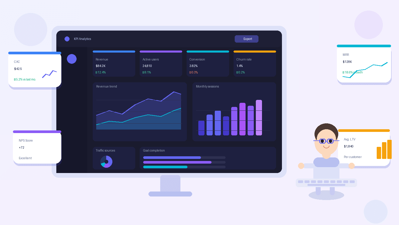
KPI Dashboard Design Best Practices
Introduction
Data plays a critical role in modern digital products. Companies rely on dashboards to monitor performance, track key metrics, and make informed decisions.
However, not all dashboards are effective.
Many dashboards fail because they present too much data without clear structure or meaningful insights. Instead of helping users make decisions, they overwhelm users with complex charts and unnecessary information.
This is where KPI dashboard design becomes essential.
A KPI dashboard focuses on presenting the most important metrics that help teams understand performance and take action quickly.
Well-designed KPI dashboards allow users to:
- monitor business performance
- identify trends and anomalies
- track goals and targets
- make faster decisions
For product designers working on analytics platforms or SaaS products, understanding KPI dashboard design is essential.
If you want to explore broader concepts related to dashboards, you may also find these topics helpful:
- Dashboard UX Design Best Practices
- Data Visualization UX Principles for Modern Dashboards
- Enterprise Dashboard Design Guide for UX Designers
In this guide, we will explore KPI dashboard design best practices and how product designers can create dashboards that deliver clear insights.
What Is a KPI Dashboard?
A KPI dashboard is a visual interface that displays Key Performance Indicators (KPIs) in a clear and organized way.
KPIs represent measurable values that indicate how well a business, product, or team is performing.
Examples of KPIs include:
- revenue growth
- conversion rate
- active users
- customer retention
- operational efficiency
- system uptime
A KPI dashboard consolidates these metrics into a single view so users can monitor performance quickly.
Unlike detailed analytics dashboards, KPI dashboards focus on high-level insights rather than deep data exploration.
Their primary purpose is to help users answer one important question:
Are we performing well right now?
Why KPI Dashboard Design Matters
Poorly designed dashboards create confusion.
Users struggle to understand what the data means or which metrics are important.
Effective KPI dashboard design solves this problem by structuring information in a way that supports decision making.
Key benefits of well-designed KPI dashboards include:
Faster Decision Making
Clear KPI dashboards allow users to understand performance within seconds.
This enables faster response to trends and issues.
Improved Data Visibility
Dashboards bring critical business metrics into a single interface.
This improves visibility across teams.
Better Performance Monitoring
Teams can track goals and performance targets more effectively when KPIs are clearly displayed.
Reduced Cognitive Load
A well-structured dashboard prevents information overload and makes data easier to interpret.
Core Principles of KPI Dashboard Design
Designing effective KPI dashboards requires careful consideration of how users interpret information.
Here are key principles product designers should follow.
1. Prioritize the Most Important Metrics
The biggest mistake in dashboard design is including too many metrics.
A KPI dashboard should focus only on the most critical performance indicators.
Most dashboards should highlight between:
- 5 to 9 key metrics
These metrics should represent the most important indicators of success.
For example, a SaaS dashboard might include:
- monthly recurring revenue
- active users
- churn rate
- conversion rate
- customer acquisition cost
Displaying too many KPIs reduces clarity and increases cognitive load.
2. Use Clear KPI Cards
KPI cards are one of the most effective ways to display metrics.
A typical KPI card includes:
- metric name
- current value
- trend indicator
- comparison to previous period
Example KPI card:
Monthly Revenue
$120,000
↑ 8% from last month
These cards allow users to scan key metrics quickly.
They should be placed at the top of the dashboard where users expect to see summary insights.
3. Show Trends Over Time
Single numbers provide limited context.
Users need to understand how metrics change over time.
This is why trend visualization is important.
Common chart types include:
- line charts
- bar charts
- area charts
For example, a line chart showing monthly active users over time provides more insight than displaying a single number.
Trend visualization helps users identify:
- growth patterns
- seasonal changes
- performance drops
4. Provide Context for Metrics
Metrics without context can be misleading.
KPI dashboards should include context such as:
- comparison with previous periods
- percentage change indicators
- target benchmarks
Examples:
Conversion Rate
4.2%
↓ 1.3% from last week
Context helps users quickly understand whether performance is improving or declining.
5. Design for Scanability
Users should be able to understand a dashboard within seconds.
To achieve this, designers should focus on:
- clear hierarchy
- consistent layout
- simple visual structure
Effective scanability can be achieved through:
- grouping related metrics
- using whitespace
- aligning dashboard cards
- maintaining visual consistency
Scanable dashboards reduce cognitive effort and improve usability.
6. Use Color Carefully
Color plays an important role in dashboard design.
However, excessive color can reduce clarity.
A good approach is to use color primarily for:
- status indicators
- alerts
- performance changes
For example:
Green → positive performance
Red → negative performance
Neutral → stable performance
Using color intentionally helps users quickly identify important insights.
7. Support Drill-Down Exploration
KPI dashboards provide high-level insights, but users may want to explore deeper data.
Designers should provide drill-down capabilities that allow users to access more detailed reports.
Example interaction:
- User clicks revenue KPI
- System opens detailed revenue analytics
- User explores data by region or product
This layered approach balances overview insights with detailed exploration.
Common KPI Dashboard Design Mistakes
Even experienced designers sometimes create ineffective dashboards.
Common mistakes include:
Too Many Metrics
Displaying too many metrics overwhelms users and reduces clarity.
Focus on essential KPIs.
Inconsistent Visual Design
Different chart styles and layouts create confusion.
Maintain visual consistency across dashboard elements.
Lack of Hierarchy
Important insights should appear at the top of the dashboard.
Less critical data should appear lower.
Poor Data Visualization
Incorrect chart types make data harder to interpret.
Choose visualizations that match the data structure.
How KPI Dashboards Improve Product Experiences
KPI dashboards play an important role in modern SaaS products and enterprise systems.
They help users:
- monitor performance
- track business goals
- identify opportunities
- detect issues early
For product teams, well-designed dashboards improve both usability and decision making.
When users can clearly understand performance metrics, they are more confident in the product and more likely to rely on it for daily workflows.
Designing effective KPI dashboards requires a combination of:
- UX design
- data visualization
- product thinking
Key Takeaways
KPI dashboards are powerful tools for communicating performance data.
Important best practices include:
- prioritize critical metrics
- use KPI cards for quick insights
- visualize trends over time
- provide context for metrics
- design dashboards for scanability
- support drill-down exploration
Product designers who apply these principles can create dashboards that are not only visually appealing but also highly actionable.
Conclusion
KPI dashboard design is a crucial skill for product designers working with data-driven products.
Effective dashboards transform raw data into insights that help teams make better decisions.
By prioritizing clarity, hierarchy, and meaningful data visualization, designers can create dashboards that deliver real value to users.
In modern SaaS platforms and enterprise products, dashboards are often the central interface through which users interact with data.
Designing them well ensures that information is not just visible, but also understandable and actionable.