Dashboard

Agastya Agro Limited Analytics Platform

A multi-level enterprise analytics dashboard designed to help Agastya Agro Team to monitor sales performance, dealer credit exposure, collections, and inventory health.

Enterprise DashboardData VisualizationSales AnalyticsInventory ManagementFinTech DashboardSaaS DashboardRole Based SystemUX StrategyProduct DesignChart.js
Agastya Agro Limited Analytics Platform - UI/UX design case study by Saurabh Pansari

1. Project Hero & Project Overview

🚀 Enterprise Supply Chain Intelligence Platform

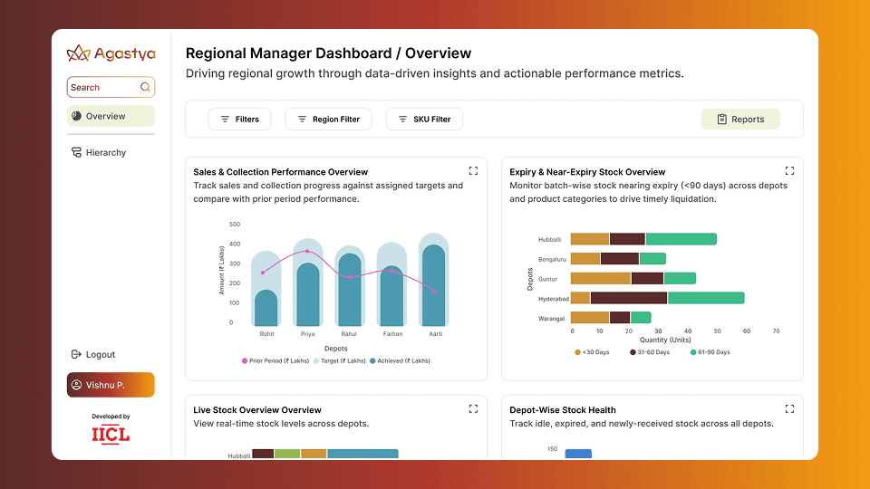
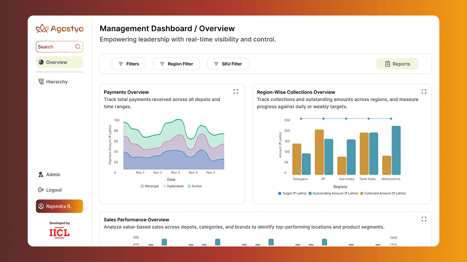
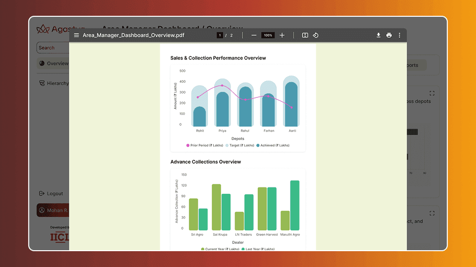
Agastya Agro required a centralized analytics dashboard to provide leadership teams with real-time visibility into depot stock levels, regional sales performance, and operational supply chain metrics.

Before the dashboard existed, critical business data was scattered across spreadsheets and reports, making it difficult for leadership to identify supply chain inefficiencies or monitor performance trends.

The goal of this product was to design a decision-focused enterprise dashboard that transforms complex operational data into clear, actionable insights.

Core Platform Focus

• Supply chain visibility
• Sales performance analytics
• Depot inventory monitoring
• Executive KPI tracking
• Data-driven decision support

By designing structured data visualizations and modular dashboard layouts, the platform allows leadership to understand business performance at a glance while enabling deeper analysis when required.

📊 Product Overview

Agastya Agro operates within a distribution-heavy supply chain environment where inventory, logistics, and regional sales performance must be monitored continuously.

The company required a centralized analytics platform capable of transforming operational data into leadership insights.

This dashboard was designed to support:

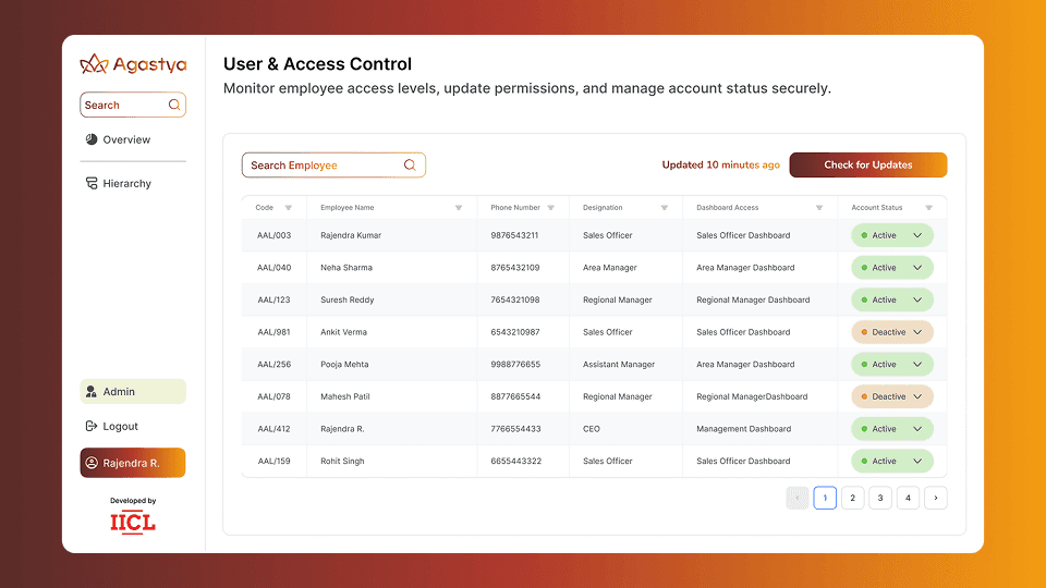
• Business leadership
• Supply chain managers
• Regional operations teams

Primary product capabilities

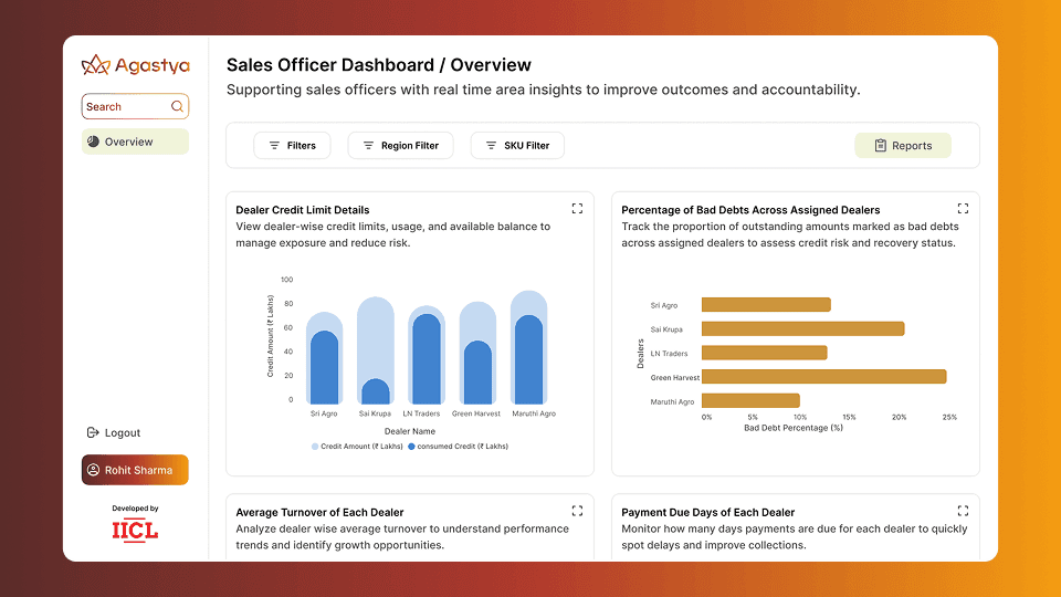
• Real-time KPI monitoring
• Sales trend analysis
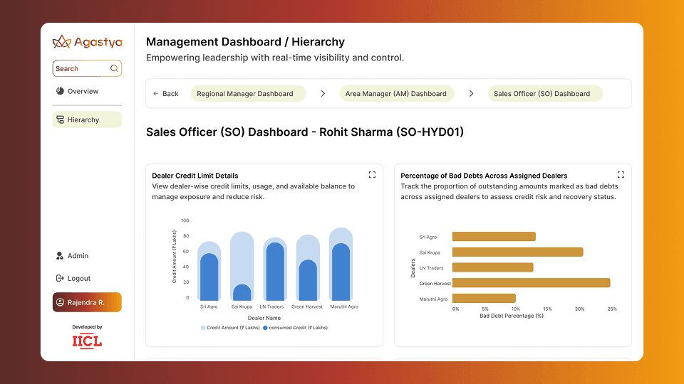
• Depot-level stock tracking
• Regional performance insights
• Operational analytics visualization

The dashboard follows a modular SaaS analytics architecture, allowing different business metrics to be organized into dedicated insight modules.

2. Problem Statement & Target Users

⚠️ Problem Statement

Agastya Agro’s leadership team faced several operational visibility challenges.

Key Issues Identified

• Supply chain data was distributed across multiple reporting tools
• Leadership lacked a unified operational view
• Depot inventory insights were difficult to interpret quickly
• Sales performance analysis required manual reporting
• Decision-making relied heavily on static spreadsheets

This created a gap between available data and actionable insights.

"We have the data, but understanding what it means takes too long."

The challenge was to design a dashboard interface that simplifies complex operational data into intuitive visual insights.

👥 Target Users

The platform was designed for multiple stakeholders within the organization.

Primary User Groups

Executive Leadership

• Monitor overall business performance
• Track revenue and operational metrics
• Identify growth opportunities

Supply Chain Managers

• Monitor depot inventory levels
• Track logistics and stock movement
• Identify supply chain bottlenecks

Regional Sales Teams

• Review regional performance metrics
• Track product demand trends
• Analyze sales growth opportunities

Each user group required different levels of data depth, which influenced how dashboards were structured.

3. Design Objectives & Product Modules

🎯 Design Objectives

The goal of this project was to design a scalable analytics system capable of simplifying complex business operations.

Key objectives included:

Role-Based Analytics Dashboards tailored for management, regional managers, area managers, and sales officers.

Operational Transparency Provide real-time visibility into sales performance, collections, and dealer credit exposure.

Inventory Intelligence Enable monitoring of stock lifecycle including near-expiry inventory across depots.

Decision Support Present complex business data through intuitive visual dashboards that support quick decisions.

🧩 Product Modules

The platform was structured into modular analytics components.

Core Modules

Executive Overview Dashboard

• Business performance summary
• Revenue and sales KPIs
• Operational indicators

Depot Inventory Monitoring

• Stock levels across distribution depots
• Inventory alerts and shortages
• Product distribution visibility

Regional Sales Analytics

• Sales performance by region
• Product category performance
• Revenue trend analysis

Operational Metrics

• Logistics performance indicators
• Supply chain efficiency metrics
• Operational activity monitoring

These modules allowed the dashboard to support both high-level insights and detailed operational analysis.

4. Information Architecture

🗂 Information Architecture

The dashboard architecture followed a hierarchical analytics model.

Navigation Structure

Dashboard Overview
→ Executive Insights

Sales Analytics
→ Regional Performance
→ Product Category Insights

Supply Chain
→ Depot Inventory
→ Logistics Metrics

Reports
→ Historical Performance
→ Data Export

Settings
→ User Preferences
→ Notification Rules

This structure ensured users could move from high-level metrics to deeper insights without cognitive overload.

5. Management Dashboard

📊 Management Dashboard Overview

The management dashboard provides leadership teams with a high-level overview of operational performance across the organization.

Key Insights Provided

• Payment trends across depots
• Region-wise collection performance
• Outbound stock movement tracking
• Sales performance comparison across product categories

Dashboard Purpose

Enable leadership to quickly evaluate financial performance and identify operational trends across the company.

6. Area Manager Dashboard

📈 Area Manager Dashboard

The area manager dashboard focuses on operational insights at the territory level.

Key Monitoring Capabilities

• Depot-level stock visibility
• Sales officer performance tracking
• Collection progress across dealers
• Inventory lifecycle monitoring

The interface allows managers to quickly detect operational issues within their assigned territories.

7. Regional Manager Dashboard

🌍 Regional Manager Dashboard

Regional dashboards focus on monitoring performance across multiple territories.

Managers can analyze:

• Regional sales progress
• Collection performance across depots
• Inventory movement across warehouses
• Performance comparison between sales teams

This level of the system helps managers identify regional performance gaps and guide their teams toward achieving targets.

8. Sales Officer Dashboard

👨‍💼 Sales Officer Dashboard

The sales officer dashboard provides detailed dealer-level insights required for day-to-day field operations.

Dealer Analytics

• Dealer credit limit monitoring
• Credit consumption tracking
• Dealer turnover comparison
• Payment due day monitoring

Operational Support

These insights allow sales officers to manage dealer relationships more effectively and improve collection performance.

9. Design Process

🎨 Design Process

The dashboard design followed a structured product design workflow.

1. Problem Discovery

• Stakeholder interviews
• Data reporting review
• Business KPI mapping

2. Data Structuring

• Identified core operational metrics
• Grouped KPIs into logical modules
• Defined dashboard hierarchy

3. Wireframing

Low-fidelity wireframes created in Figma to validate layout structure.

Focus areas:

• KPI prioritization
• Visual hierarchy
• Data grouping

4. Visual Design

Designed a clean enterprise SaaS dashboard UI focusing on:

• Card-based data modules
• Clear typography hierarchy
• Structured grid layouts

5. Prototyping

Interactive dashboard flows allowed stakeholders to review:

• Navigation structure
• Data readability
• Dashboard interactions

10. Design System

🎨 Design System

A scalable design system was created to maintain consistency across the entire platform.

Reusable UI components include:

• KPI metric cards
• analytics chart widgets
• filtering and search components
• hierarchical navigation modules
• reporting and export interfaces

The design system enabled the platform to scale efficiently across 80+ product screens.

11. Data Visualization Strategy

📊 Data Visualization Strategy

The dashboard relied on structured visualizations to simplify complex datasets.

Key Visualization Principles

• Highlight critical KPIs first
• Use charts to reveal trends
• Enable quick comparisons between regions

Chart Types Used

Line Charts

• Sales growth trends
• Revenue over time

Bar Charts

• Regional sales comparisons
• Product category performance

Pie Charts

• Market share breakdown
• Distribution proportions

KPI Cards

• Total sales
• Inventory levels
• Operational metrics

Charts were implemented using Chart.js, ensuring scalability and smooth rendering across devices.

12. Key Screens

🖥 Key Screens

Executive Dashboard

• Business overview KPIs
• Sales trend graphs
• Operational summary cards

Depot Inventory Dashboard

• Depot-wise stock levels
• Inventory alerts
• Product availability charts

Sales Analytics Dashboard

• Regional performance charts
• Product sales distribution
• Revenue insights

Each screen was designed to prioritize clarity and decision speed.

Key Screens 1
Key Screens 2
Key Screens 3
Key Screens 4
Key Screens 5
Key Screens 6
Key Screens 7
Key Screens 8

13. Design Challenges

Design Challenges

Designing enterprise analytics dashboards often involves simplifying complex datasets.

Major Challenges

Complex Data Density

Supply chain metrics can quickly overwhelm users.

Solution
Structured KPI hierarchy and modular dashboards.

Data Interpretation

Users needed insights quickly without analyzing raw data.

Solution
Trend-focused visualizations and clear KPI summaries.

Scalability

Future metrics needed to be integrated without redesign.

Solution
Created a component-driven dashboard design system.

14. Final Outcome

🚀 Project Outcome

The Agastya Agro analytics platform provides a centralized system for monitoring operational performance across the company.

Leadership Benefits

• real-time visibility into financial performance
• regional sales monitoring
• faster strategic decision making

Operational Benefits

• improved dealer credit management
• better collection tracking
• enhanced inventory monitoring

The platform transforms complex operational datasets into clear, actionable insights that empower every level of the organization.

15. Figma Prototype Embed