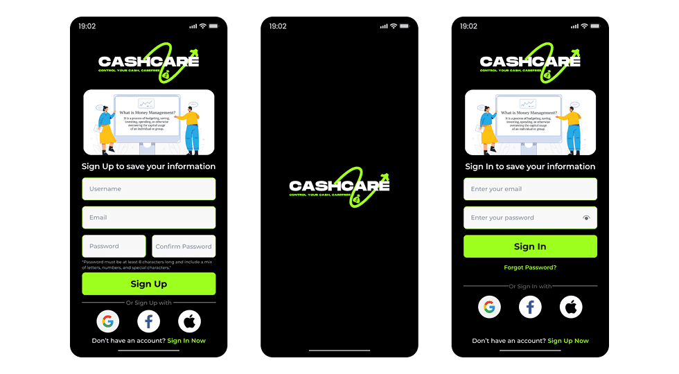
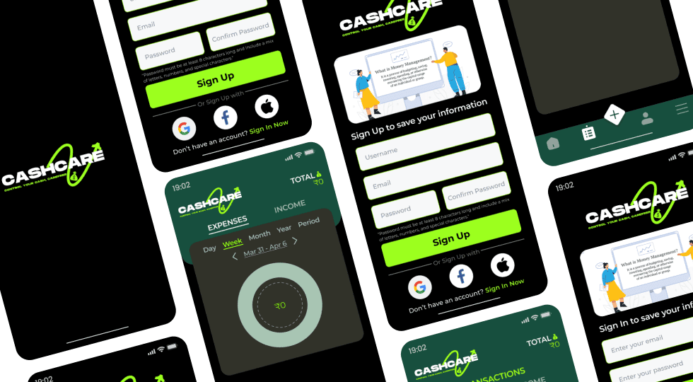
App

CashCare - Personal Finance Management App

A mobile finance management app designed to help users track income, monitor expenses, and manage transactions through clear visual insights and a simplified budgeting experience.

Mobile AppFintechUI DesignPersonal Finance
CashCare - Personal Finance Management App - UI/UX design case study by Saurabh Pansari

1. Overview & Problem Statement

Project Overview

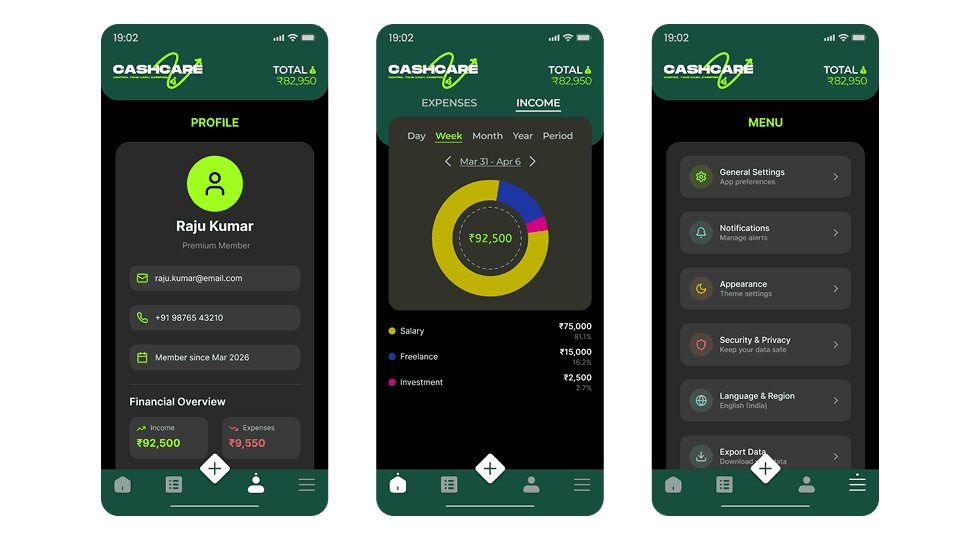
CashCare is a personal finance management mobile application concept designed to help users monitor their financial activities in a simple and visual way.

The interface focuses on clear financial insights, easy transaction tracking, and simple navigation to improve everyday money management.
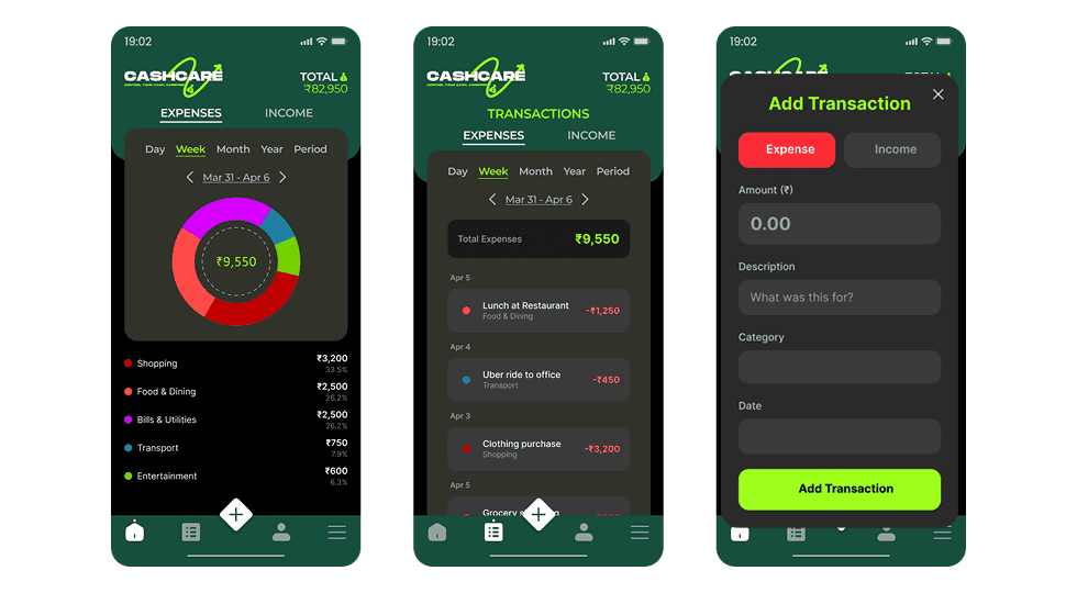
Problem Statement

Many finance apps are complex and overwhelming, especially for users who only want to track daily expenses and income.

The challenge was to design a finance management experience that simplifies financial tracking while providing meaningful insights into spending habits.

2. Goals & Target Audience

Goals

The goal was to design a clean and user-friendly finance dashboard where users can quickly understand their financial status.

The app focuses on simplifying expense tracking, visualizing income and spending patterns, and allowing users to manage transactions easily.

Target Audience

The app is designed for individuals who want a simple way to manage their daily finances.

It is particularly useful for students, freelancers, and working professionals who need to track income sources and monitor spending habits.

3. Information Architecture & Navigation

Information Architecture

The application organizes financial information into key sections such as expenses, income, transactions, and profile settings.

Data is displayed through visual charts and categorized transaction lists to help users understand spending patterns quickly.

Navigation Structure

A bottom navigation bar allows users to access main sections such as home, transaction history, profile, and settings.

A floating action button enables users to quickly add a new transaction without navigating through multiple screens.

4. Design Strategy

Design Approach

The design uses a dark theme to create a focused and modern fintech interface.

Green accent colors are used to highlight important financial indicators such as totals, actions, and positive income values.

Visual Direction

Circular charts provide quick visual insights into spending categories and income distribution.

Clean typography and card-based layouts help organize financial information in a readable and structured way.

5. Visual Design & Key Screens

Visual Design

The interface combines a dark background with vibrant accent colors to create strong visual contrast and clear hierarchy.

Charts, icons, and transaction cards help users quickly understand their financial activity.

Key Screens

The dashboard screen provides an overview of expenses and income through visual charts and category breakdowns.

The transactions screen displays a chronological list of financial activities with categorized labels.

The profile and settings screens allow users to manage personal information and app preferences.

Visual Design & Key Screens 1
Visual Design & Key Screens 2
Visual Design & Key Screens 3

6. Interaction & Learnings

Interaction Design

Users can easily switch between expense and income tracking views to analyze financial activity.

The quick add transaction feature allows users to instantly log expenses or income with minimal effort.

Key Learnings

This project emphasized the importance of simplifying complex financial data into easy-to-understand visuals.

Clear information hierarchy and intuitive actions are essential for improving usability in finance applications.

7. Figma Prototype Embed