Tagline: Designing a vibrant flower shopping experience with visually themed product sections.
Role: UI/UX Designer
Timeline: 2 Days
Tools: Figma
Designed a visually engaging landing experience for a flower pot store where users can explore different flowers through themed sections and easily place an order.

Tagline: Designing a vibrant flower shopping experience with visually themed product sections.
Role: UI/UX Designer
Timeline: 2 Days
Tools: Figma
Floripots is a concept project designed to showcase flowers and decorative pots through a visually engaging landing page experience.
The interface uses bold color themes and large illustrations to highlight different types of flowers while maintaining a clean and simple layout.
Each section introduces a different flower with descriptive content and a clear call-to-action to place an order.
Many flower store websites present product listings in dense grids that fail to capture the beauty and emotional appeal of flowers.
The challenge was to design a landing experience that highlights the uniqueness of each flower while keeping the browsing experience simple.
The objective was to design a visually rich flower browsing experience that allows users to explore different flowers and easily place an order.
The interface targets people looking to purchase flowers for home decoration, gifting, or gardening.
These users prefer visually appealing websites that showcase flowers clearly and make ordering simple.
The design focuses on large hero sections where each flower is highlighted with its own background color and description.
The layout keeps the flower illustration as the central visual element while placing content and call-to-action on the opposite side.
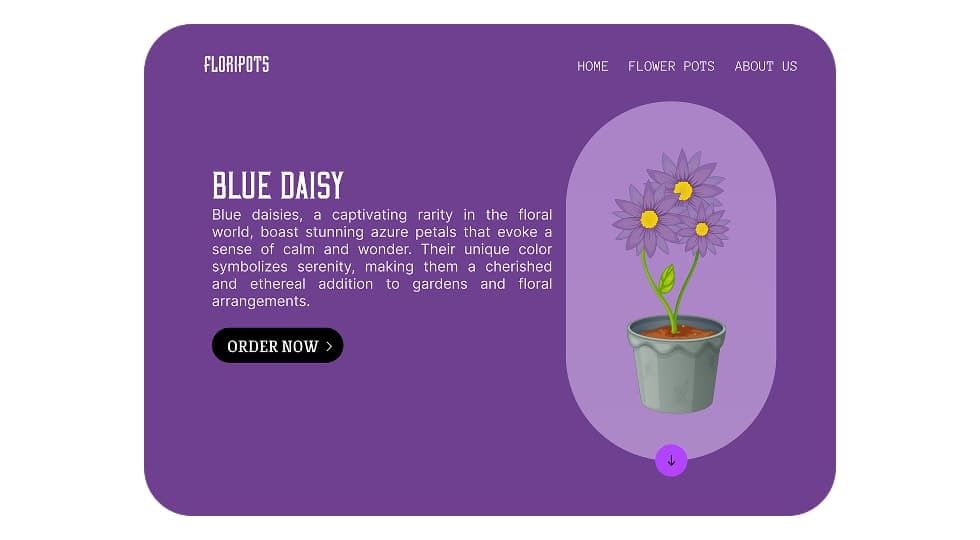
Users scroll through different flower sections such as Primrose, Rose, Sunflower, and Blue Daisy.
Each section presents a unique color theme that reflects the identity of the flower.
Users can click the order button to purchase the selected flower.
The layout follows a split-screen hero design.
The left side contains the flower title, description, and call-to-action, while the right side highlights the flower illustration.
The visual style uses vibrant color themes inspired by the natural colors of each flower.
Soft gradients and large illustrations create a lively and inviting interface that reflects the beauty of flowers.
The project includes multiple flower showcase sections such as Primrose, Rose, Sunflower, and Blue Daisy.
Each section introduces the flower with a unique color theme and provides a clear order action.
The final design creates an engaging flower browsing experience that visually highlights each product while keeping the ordering process simple.
Designing nature-themed interfaces requires strong use of color and imagery to evoke emotion.
Using different color themes for each section helps create visual variety while maintaining a consistent layout.
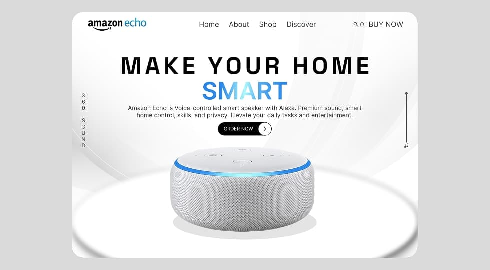
Designed a modern product landing page interface for Amazon Echo that highlights the smart home experience through clean layout, strong typography, and product-focused visual hierarchy.

Designed a modern product showcase experience inspired by Apple’s website, focusing on visuals, product comparisons, and smooth scroll-based interactions to highlight different AirPods models.
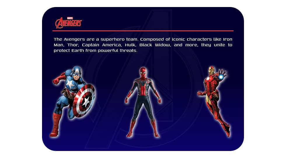
Designed an interactive Avengers-themed website where users can explore superheroes and view detailed character profiles through a dynamic character selection interface.
Discover the core UI design principles that help designers create visually clear, consistent, and effective digital interfaces.
Discover practical dashboard UX design principles that help designers present complex data clearly and improve user decision making.