Website

MakeGram - Modern Cosmetics E-commerce Website

A modern cosmetics e-commerce website concept designed to showcase beauty products through bold typography, elegant product displays, and a clean shopping experience.

E-commerceBeauty ProductsWeb DesignUI Design
MakeGram - Modern Cosmetics E-commerce Website - UI/UX design case study by Saurabh Pansari

1. Overview & Problem Statement

Project Overview

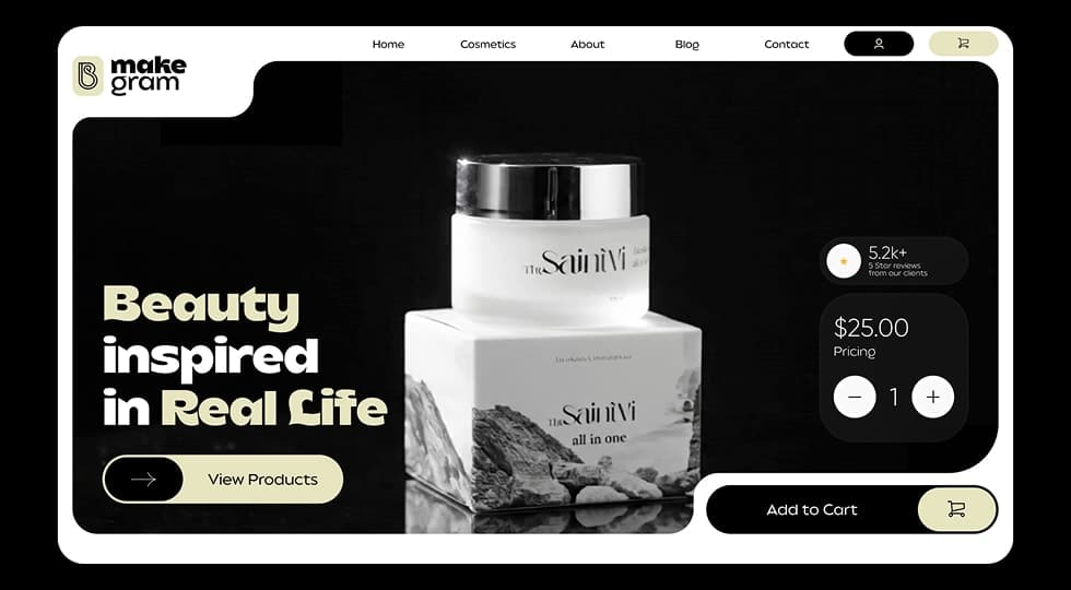
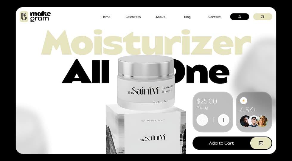
MakeGram is a concept e-commerce website designed for beauty and cosmetic products.

The interface focuses on clean layouts, elegant typography, and product-focused visuals to create a modern shopping experience.

The design highlights skincare products using minimal UI elements while maintaining clear purchasing interactions.

Problem Statement

Many beauty e-commerce websites display too many products and elements on a single screen, which can overwhelm users.

The challenge was to create a clean and premium shopping experience where the product remains the main focus while keeping navigation simple.

2. Goals & Target Audience

Goals

The goal was to design a visually appealing cosmetics shopping experience that highlights product quality and brand aesthetics.

The interface emphasizes clarity, minimal design, and smooth purchasing interactions.

Target Audience

The platform targets users interested in skincare and cosmetic products.

It focuses on users who prefer a clean, premium, and modern online shopping experience.

3. Information Architecture & Navigation

Information Architecture

The website structure includes key sections such as Home, Cosmetics, About, Blog, and Contact.

Product exploration is supported through category browsing and direct product highlights on the homepage.

Navigation Structure

A top navigation bar allows users to easily access main sections of the website.

User profile and shopping cart actions are placed on the right side of the header for quick interaction.

4. Design Strategy

Design Approach

The interface uses a clean and modern design language with soft neutral tones combined with bold typography.

Large product visuals and minimal UI components help maintain focus on the cosmetic products.

Visual Direction

Rounded containers, soft shadows, and spacious layouts create a premium aesthetic suitable for beauty brands.

The color palette balances dark and light backgrounds to enhance product visibility.

5. Visual Design & Key Screens

Visual Design

The interface uses minimal colors, elegant typography, and large product imagery to emphasize product quality.

Rounded containers and subtle shadows enhance the premium appearance of the design.

Key Screens

The homepage introduces the beauty brand with a bold headline and call-to-action encouraging users to explore products.

The product showcase screen highlights skincare products with pricing, ratings, and purchase options.

The interface also provides quick quantity adjustment and add-to-cart actions for a smooth purchasing flow.

Visual Design & Key Screens 1
Visual Design & Key Screens 2

6. Interaction & Learnings

Interaction Design

The design focuses on simple purchasing interactions such as quick quantity selection and a clear add-to-cart action.

The layout ensures users can easily browse and purchase products without unnecessary complexity.

Key Learnings

This project demonstrated how minimal design and strong typography can enhance the visual appeal of beauty e-commerce platforms.

Maintaining a balance between product visibility and interface simplicity helps create a smooth shopping experience.

7. Figma Prototype Embed