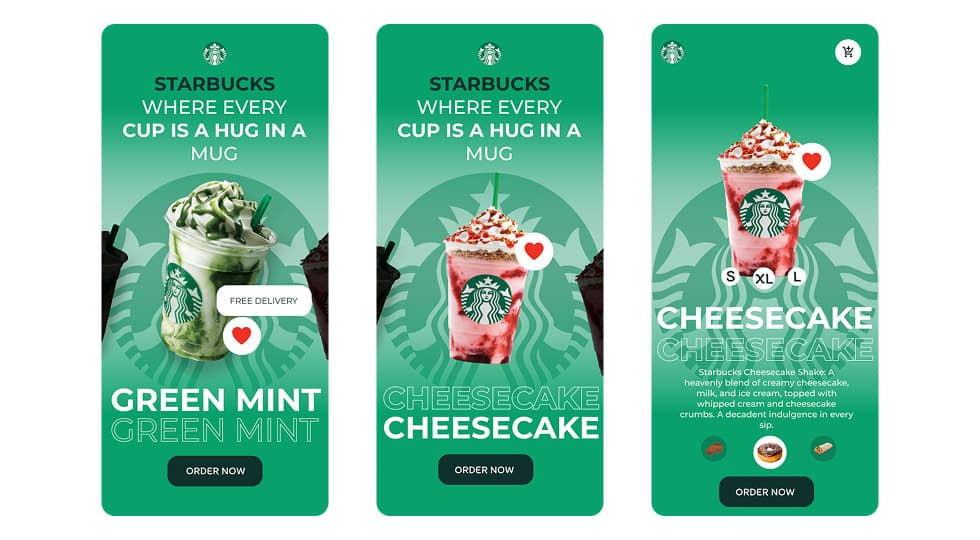
App

Starbucks Concept – Mobile Beverage Experience

Starbucks Concept – Mobile Beverage Experience

Mobile AppUI DesignFood & BeverageProduct Experience
Starbucks Concept – Mobile Beverage Experience - UI/UX design case study by Saurabh Pansari

1. Overview & Problem Statement

Project Overview

This project explores a modern mobile concept for showcasing Starbucks beverages in a visually engaging way.

The design focuses on large product visuals, clear flavor identity, and simple interactions that allow users to browse and order drinks effortlessly.

Problem Statement

Many beverage ordering apps focus heavily on menus and lists, which reduces the visual appeal of the product.

The challenge was to design an experience where the drink itself becomes the centerpiece of the interface while still supporting quick ordering and customization.

2. Goals & Target Audience

Goals

The goal was to create a visually immersive drink discovery experience that allows users to explore beverages through flavor-based storytelling.

The interface also focuses on simplifying the ordering process by keeping key actions easily accessible.

Target Audience

The design targets coffee lovers, Starbucks customers, and mobile-first users who frequently order beverages through apps.

It also appeals to younger audiences who enjoy visually rich and interactive digital experiences.

3. Information Architecture & Navigation

Information Architecture

The interface centers around the featured beverage while providing supporting actions such as selecting size, viewing details, and placing an order.

Additional content such as ingredients and related items helps users explore more options within the product page.

Navigation Structure

Minimal navigation elements keep the interface focused on the product.

Essential actions such as favorite, cart access, and ordering are placed within easy reach for quick interactions.

4. Design Strategy

Design Approach

The design uses bold color gradients inspired by drink flavors to create strong visual identity for each beverage.

Large product imagery combined with minimal interface elements helps maintain focus on the drink.

Visual Direction

Green gradients and brand-inspired elements reinforce Starbucks’ identity while maintaining a modern and fresh aesthetic.

Large typography and layered backgrounds add depth and visual hierarchy to the layout.

5. Visual Design & Key Screens

Visual Design

The interface uses vibrant color palettes that match each drink flavor while maintaining consistency with Starbucks branding.

Large drink visuals act as the main focal point while supporting UI elements remain minimal.

Key Screens

The flavor showcase screen introduces drinks such as Green Mint and Cheesecake through bold typography and product imagery.

The product detail screen provides drink descriptions, size selection options, and quick access to the order action.

Visual Design & Key Screens 1

6. Interaction & Learnings

Interaction Design

Users can swipe between different beverages to explore flavor variations and product options.

Interactive elements such as favorites, size selection, and quick ordering create a smooth and intuitive user experience.

Key Learnings

This project highlighted the importance of product-centric design in food and beverage applications.

Using strong visuals combined with simple interactions can significantly improve user engagement and make the browsing experience more enjoyable.

7. Figma Prototype Embed